Al Farasha
Adding life to Sudan’s most trusted food brand
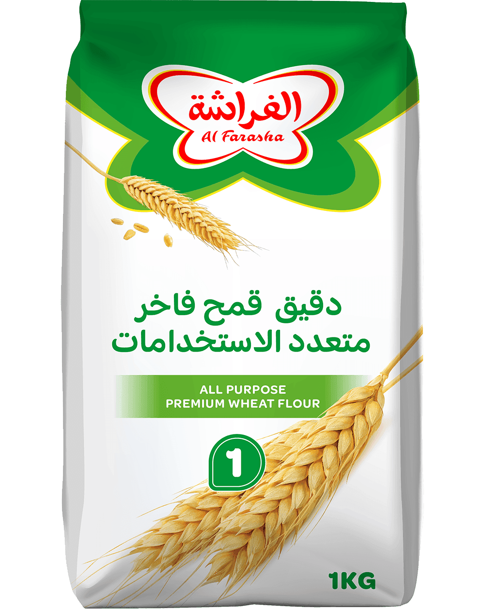
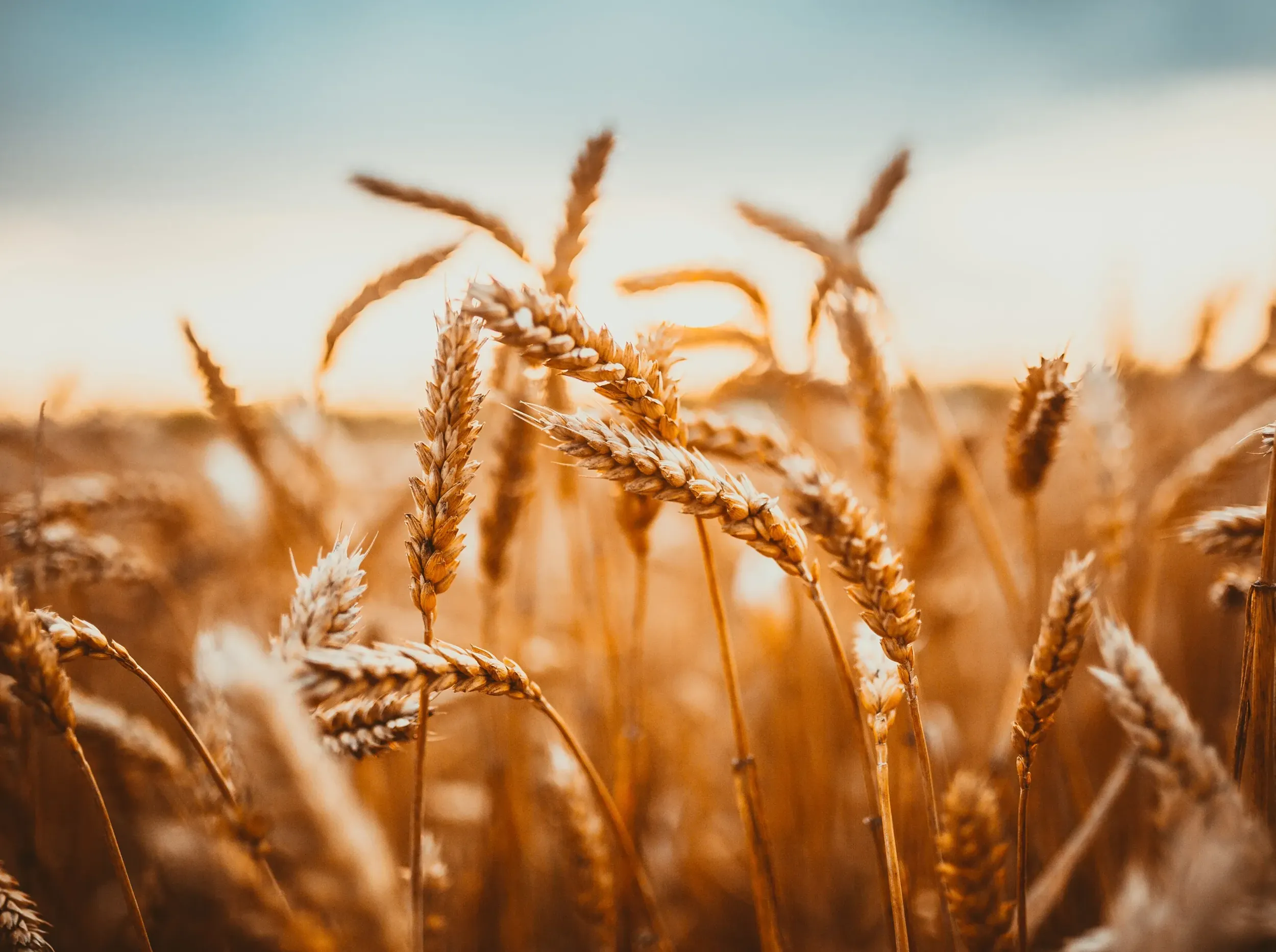
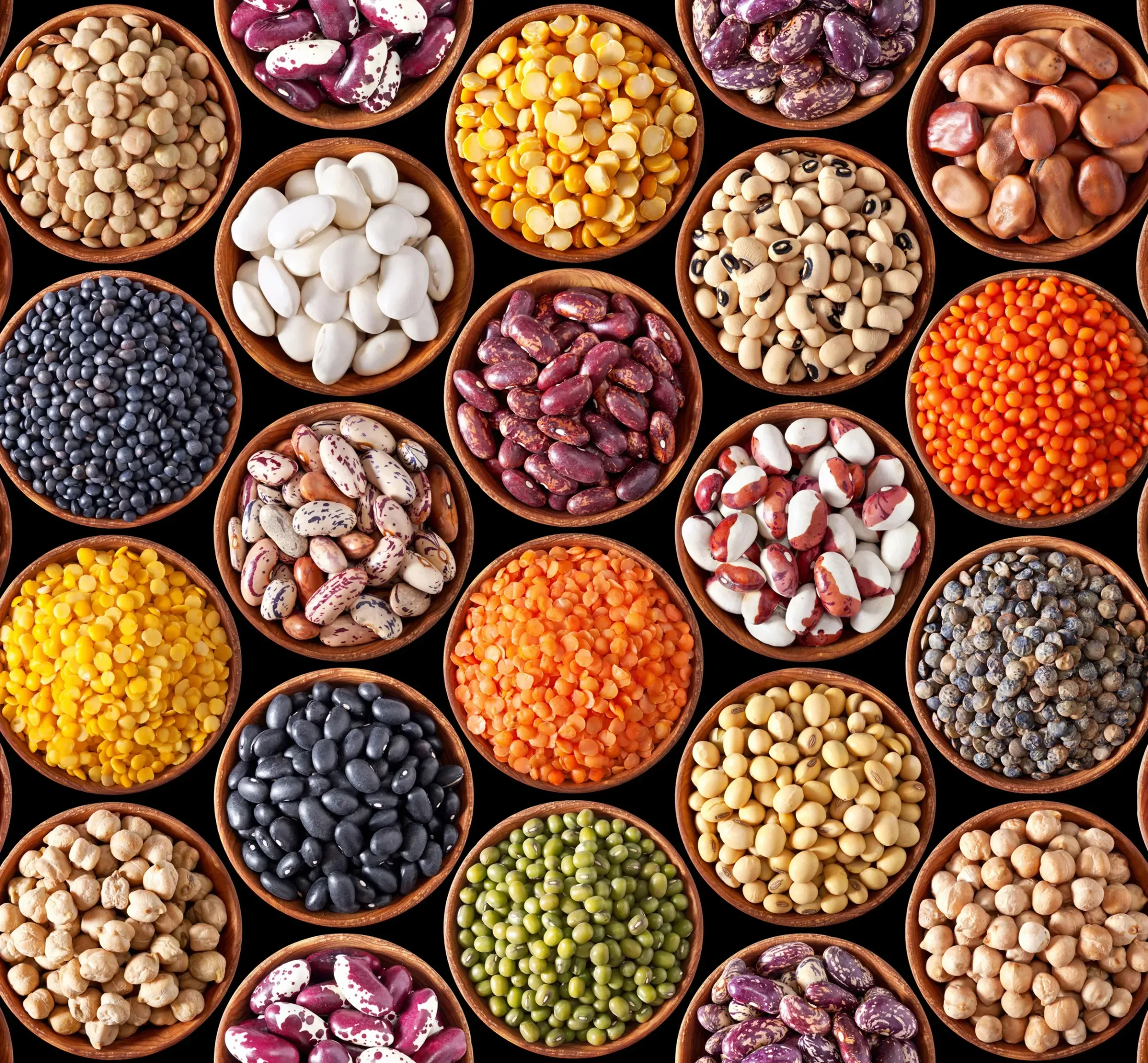
Al Farasha is Sudan’s most trusted food brands, a name that can be recognised in nearly every home in Sudan. A product range from Morouj Commodities, it has become A symbol of stability for the people in the region, Al Farasha fulfils essential needs and provides a wide range of food products of the highest quality. Products families can trust with their eyes closed. From smooth tomato paste to organic lentils; from fine flour to tasty sauces, Al Farasha’s wide ranging products are all united under one name: Al Farasha.
The Shift
Al Farasha had strong recognition for a single product. As Morouj expanded into new categories, the challenge was to unify all products under one trusted name without confusing customers, and to create packaging that stands out in an inconsistent, cluttered market.
The Breakthrough
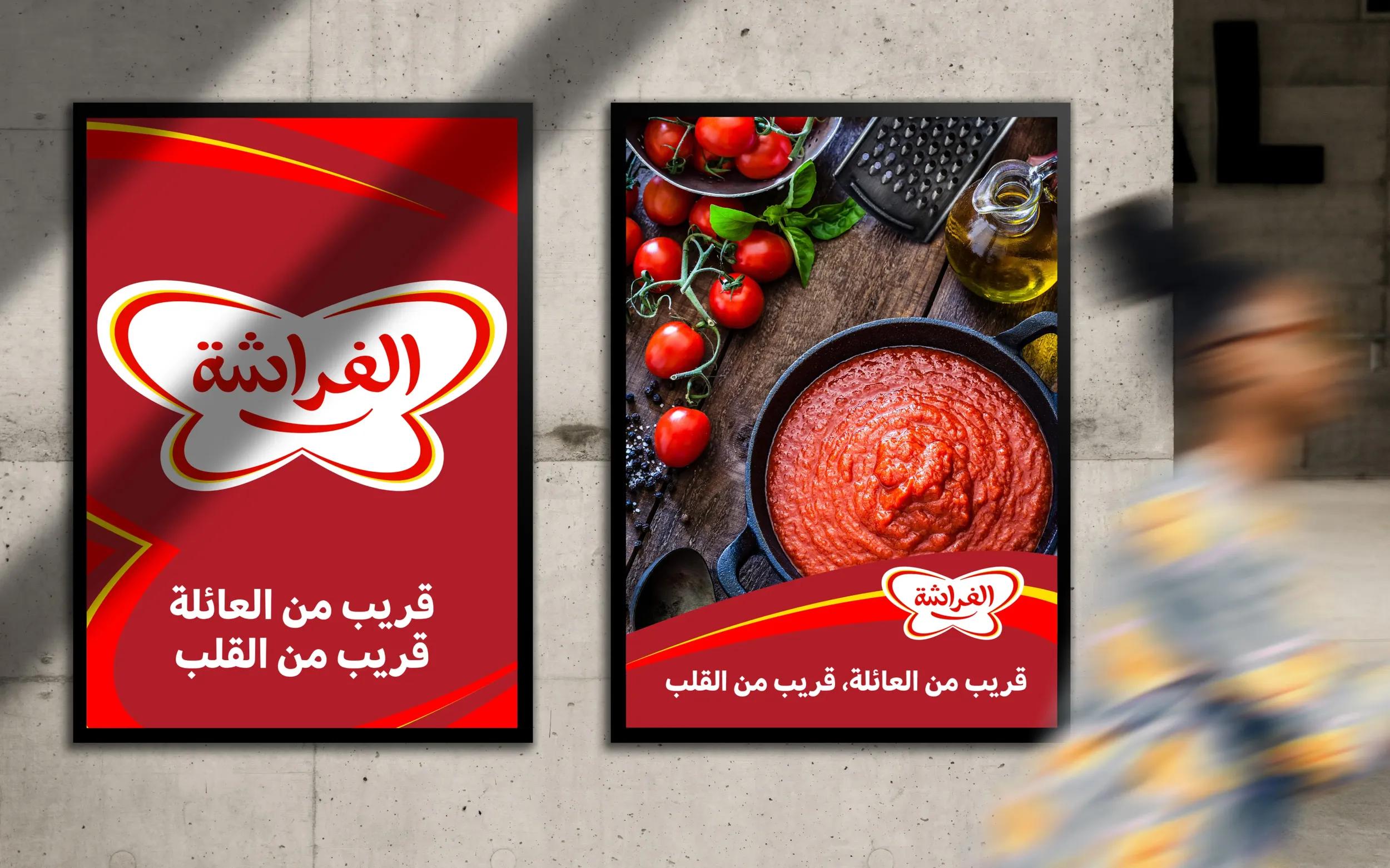
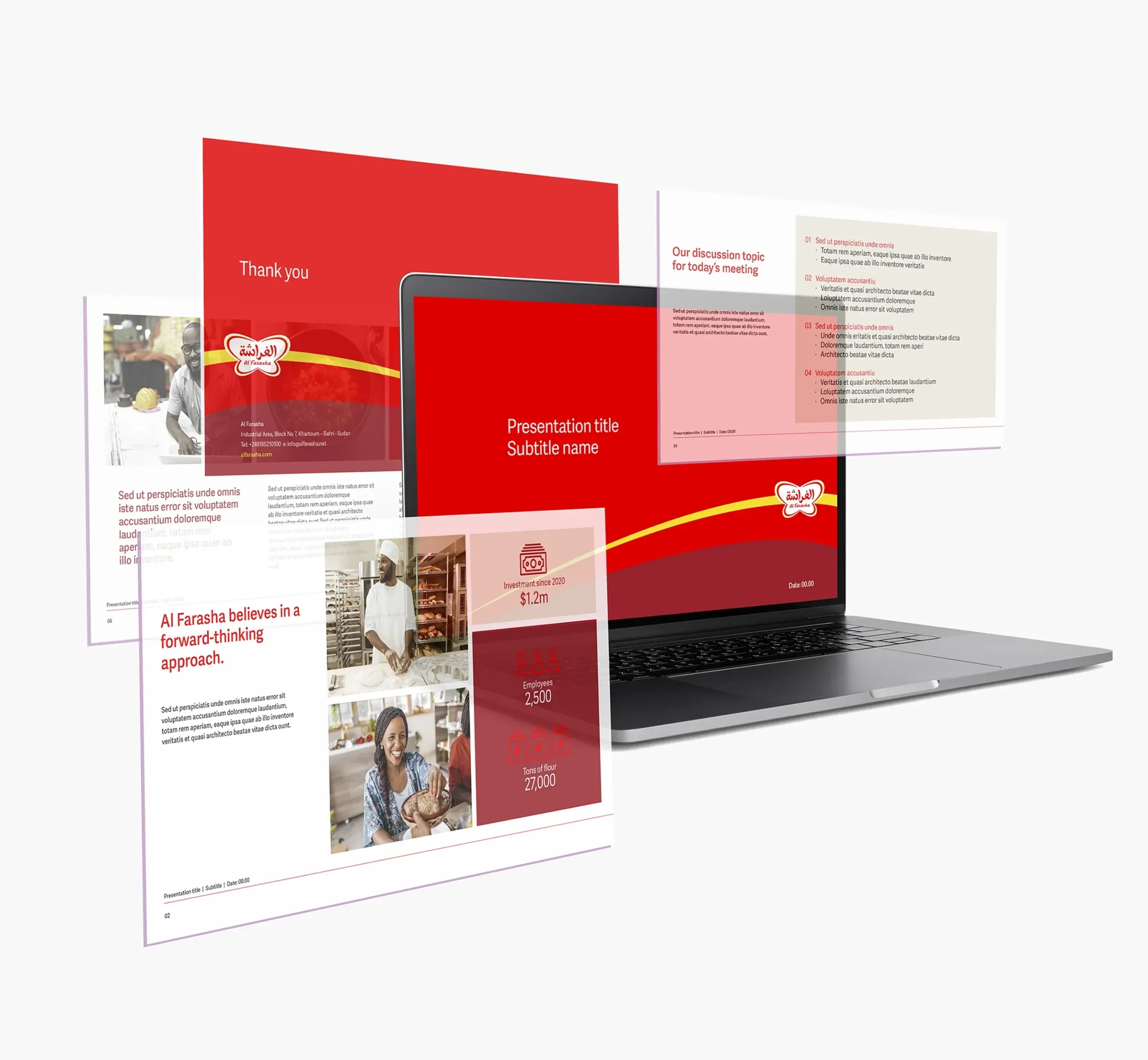
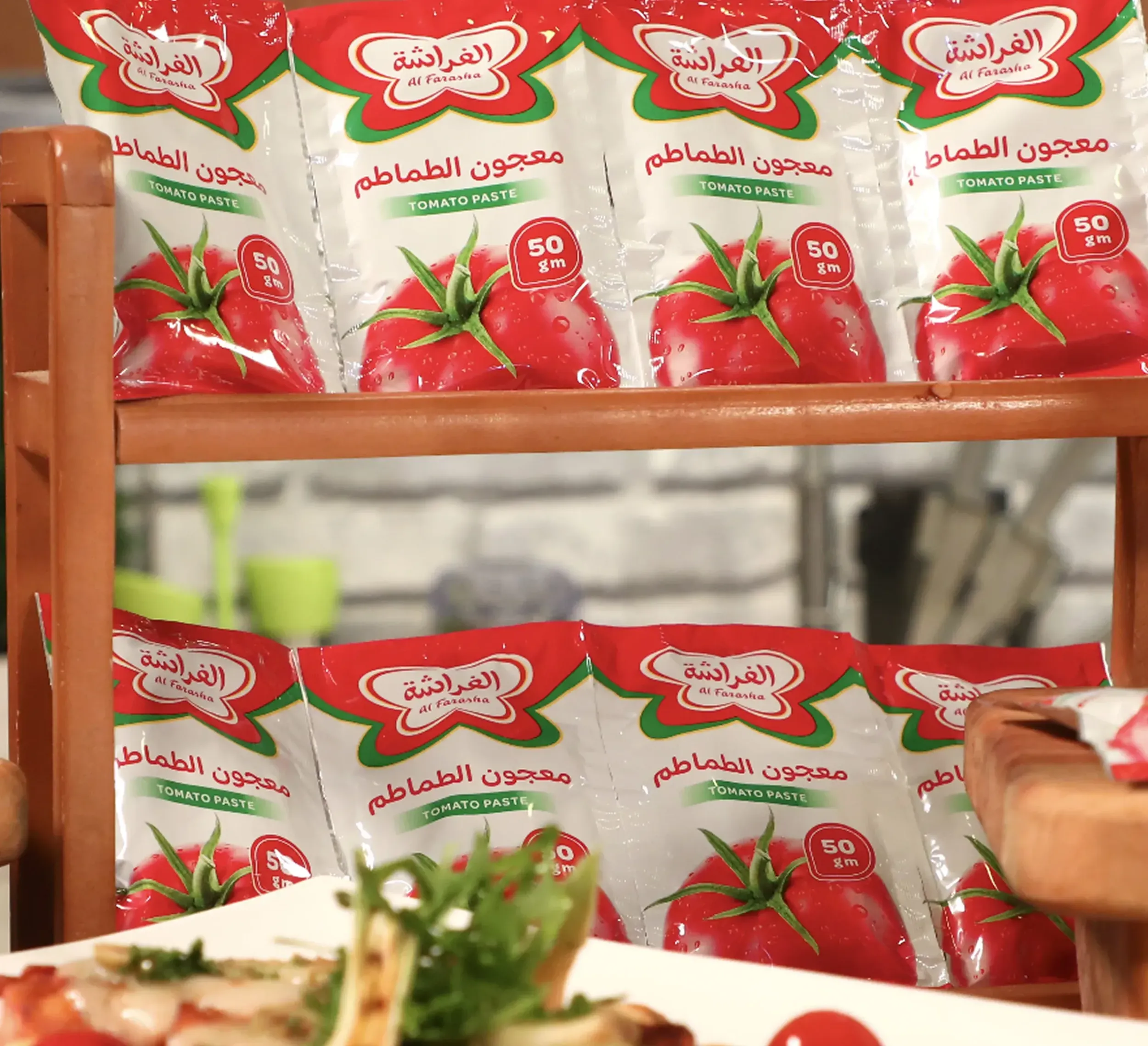
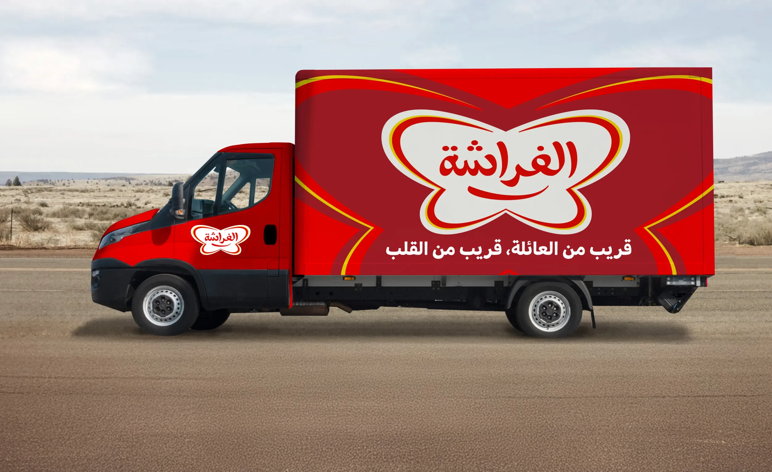
A strategy that retained the equity of the Al Farasha name, turning it into a cross-category masterbrand. We redesigned the identity, elevated the butterfly symbol, and created a packaging system that delivers maximum shelf impact in any retail condition. The result: stronger brand recognition, simplified product launches, and a bolder in-market presence.
The power of a familiarity
Rather than invent new sub-brands, we advised Morouj to leverage the name Al Farasha across all commodity products. This created a single, recognisable brand that boosted customer trust, simplified marketing, and made product expansion faster and more cost-effective.
A brand is the set of expectations, memories, stories, and relationships that, taken together, account for a consumer’s decision to choose one product or service over another.
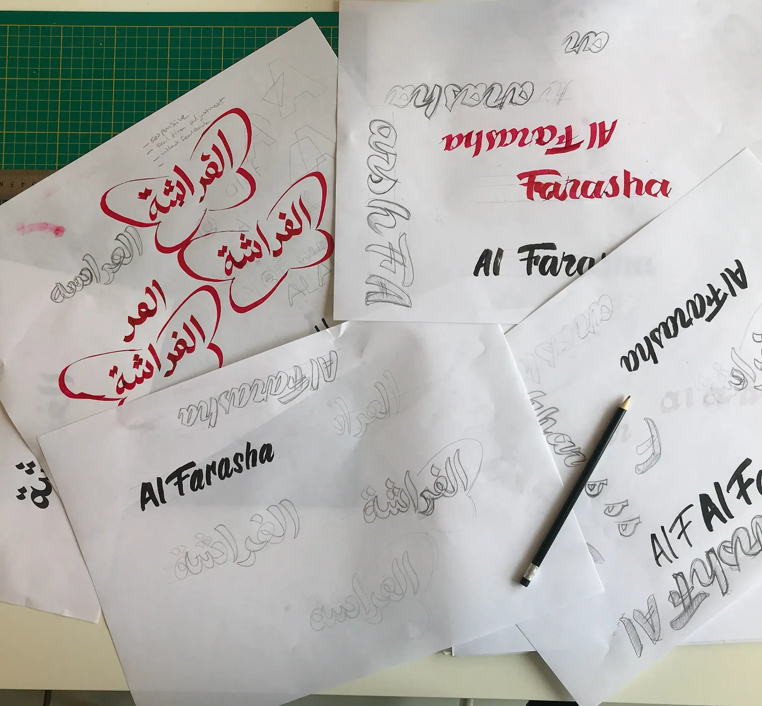
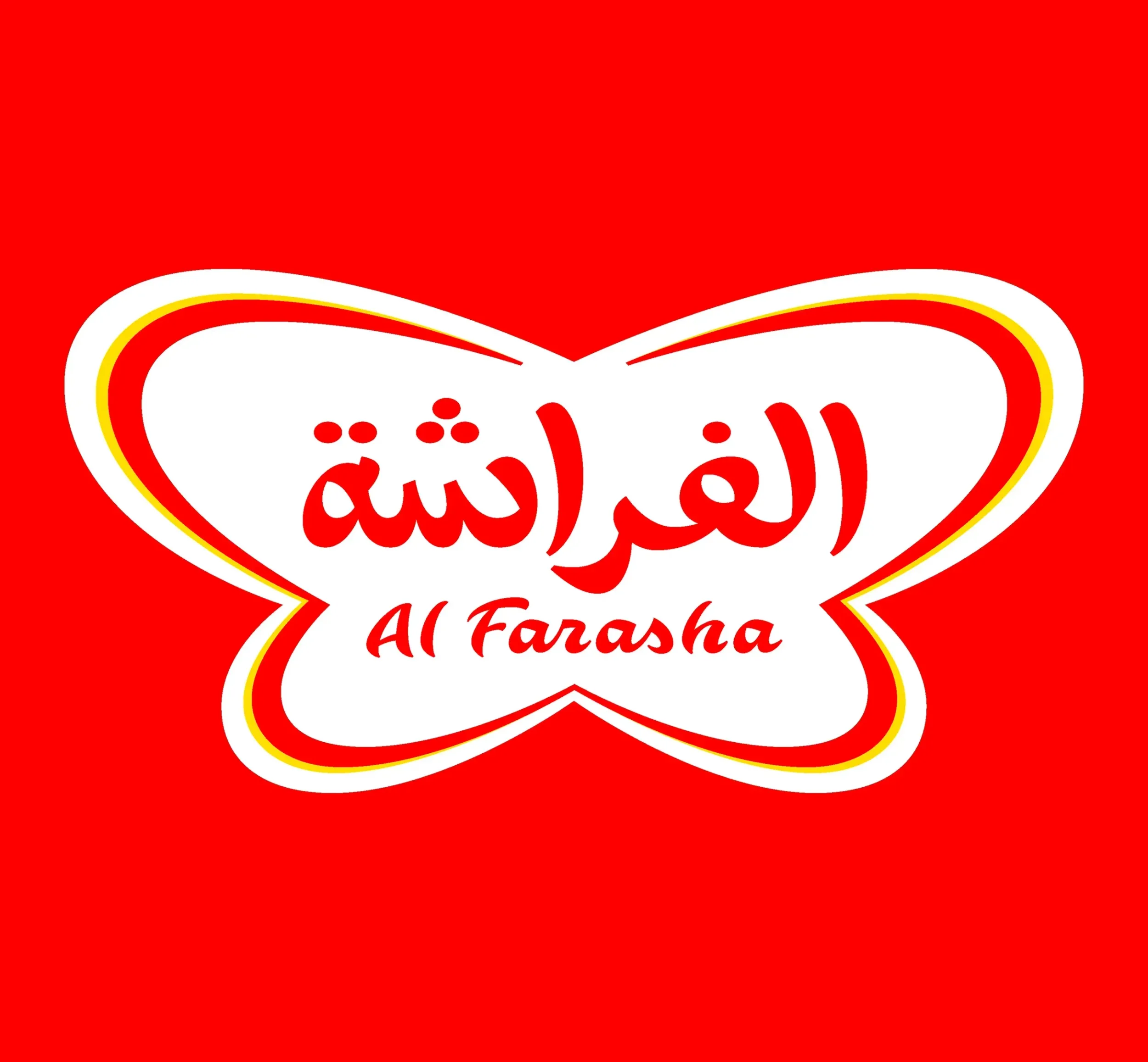
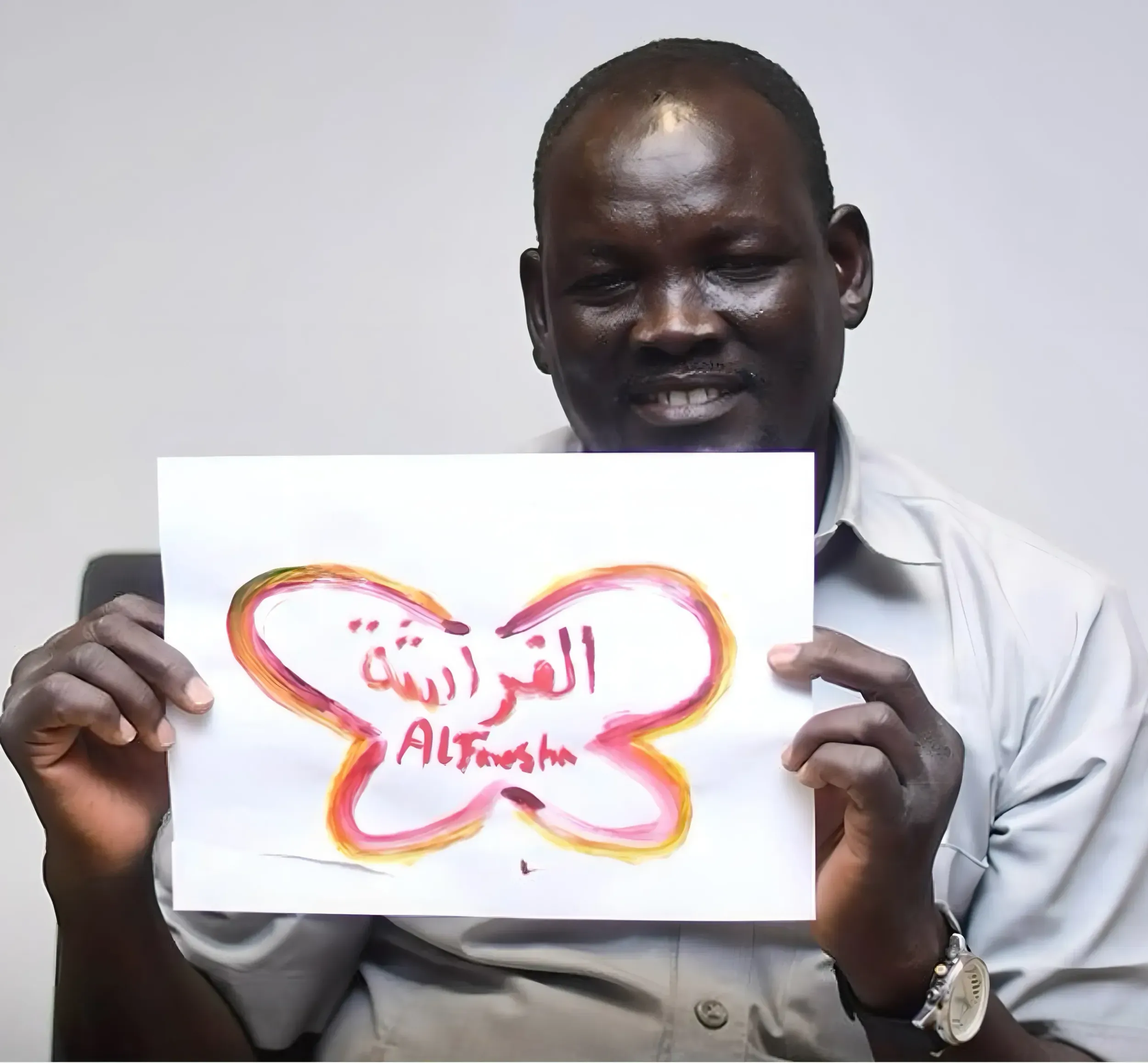
Butterfly as an icon
We evolved the original butterfly into a central design element, a distinctive holding device across all SKUs. The refreshed logotype used modern Arabic calligraphy paired with a clean English subscript, creating brand consistency while feeling fresh and local.
Launch built on simplicity and familiarity
The campaign was straightforward and confident: showing the before-and-after transformation of the Al Farasha brand. No heavy messaging, no storytelling. Just a clear signal of growth, trust, and relevance, all built around the butterfly’s evolution.
Shahd Shakir Basta Shakir
Senior Marketing Manager
Skyne is a very professional agency, committed to timelines, understands the client and the objective they are seeking. They deliver a project with an utmost standard of creativity.

Roel Vos
Partner Skyne
The Al Farasha team were on board with what we suggested, their support and their willingness to let us explore proved to be the ulimate ingredient in the recipe for the new Al Farasha brand
Belonging on shelves, in homes, and in hearts
From the refreshed packaging to campaign materials, the brand feels warm, vibrant, and proudly Sudanese. Every element was designed to feel close to the people, reinforcing Al Farasha as a brand made for everyday lives.