Morouj
Logo and branding evolution of a celebrated commodity brand
Morouj is one of Sudan’s most trusted and widely distributed commodity brands, present in nearly every household. With a workforce of over 1,800 employees and deep cultural roots, Morouj partnered with Skyne to evolve its corporate identity, keeping the heart of the brand intact while preparing it for a modern future.
The Shift
Morouj’s products were well-loved, but the parent brand lacked a modern, unified presence. The challenge was to evolve Morouj into a people-first, future-ready corporate brand that resonated both with consumers and its internal community, while staying rooted in Sudanese identity.
The Breakthrough
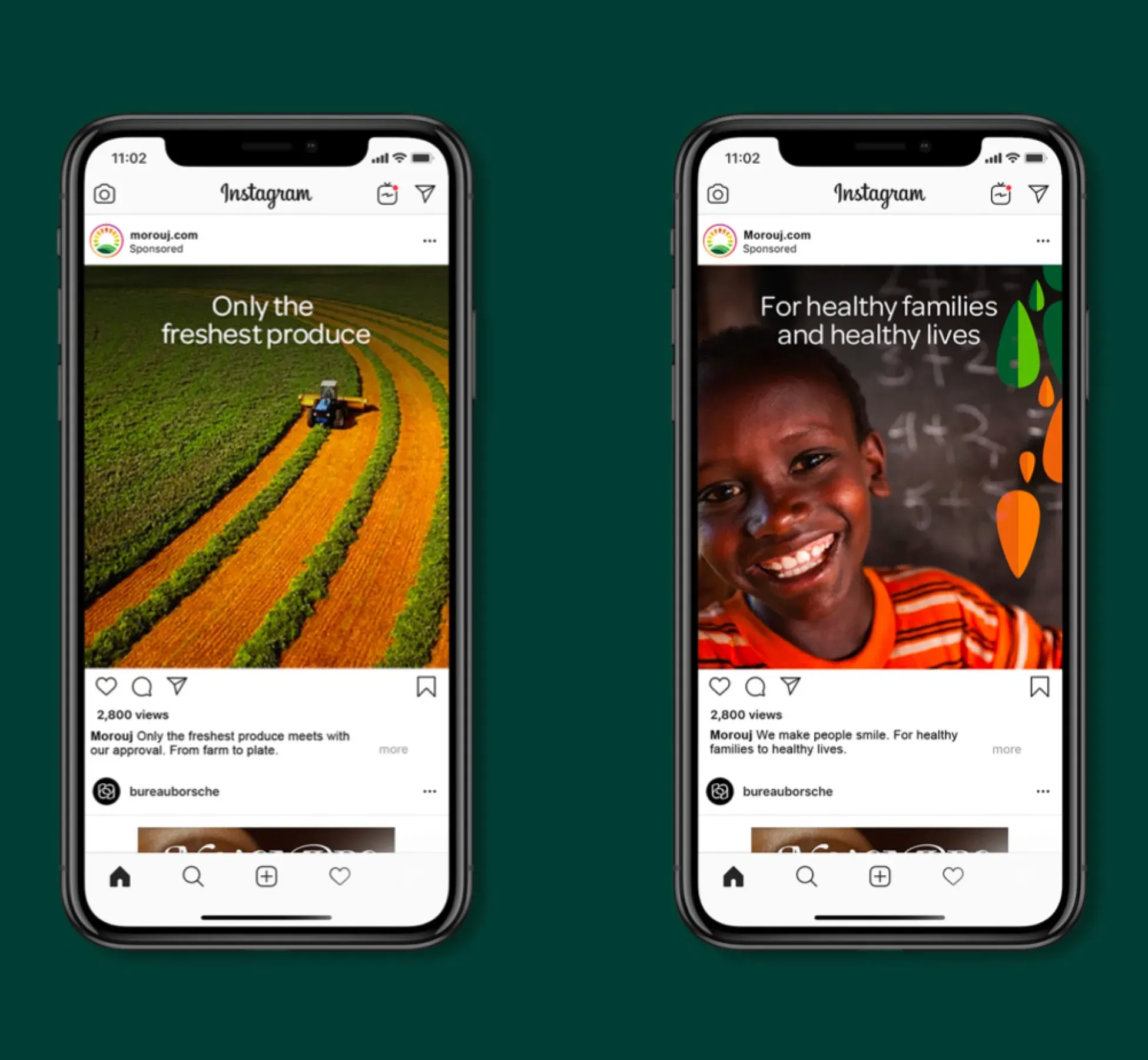
Skyne developed a refreshed brand strategy, identity, and campaign that bridged trust, cultural belonging, and ambition. The result was a unified corporate brand that inspired employees, connected with families, and signalled stability and progress, winning five Transform Awards MENA.
Built on trust and local pride
We started with in-depth interviews across departments, capturing what Morouj meant internally. Combined with market research, this revealed three strategic pillars: everyday trust, internal emotional connection, and the cultural pride of Sudan. These values guided the repositioning.
It is not the gold in the ground but the goodness in people’s hearts that feeds a nation. A brand trusted at every kitchen table is worth more than any treasure.
Infusing visual identity with meaning
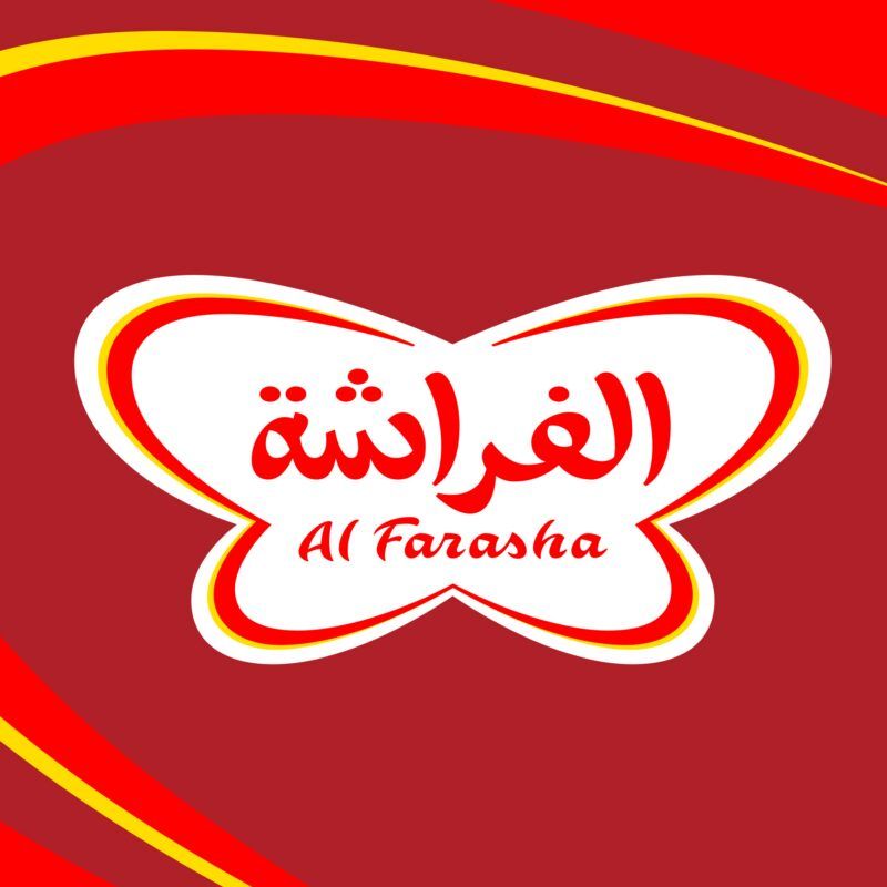
The refreshed logo is rooted in the land, sky, and sun, symbolising growth, nourishment, and vitality. The identity system retained the brand’s familiar essence while elevating it to reflect corporate maturity and long-term ambition.
The refreshed logo is rooted in the land, sky, and sun, symbolising growth, nourishment, and vitality. The identity system retained the brand’s familiar essence while elevating it to reflect corporate maturity and long-term ambition.
Representing stability and growth visually
From the refreshed logo to corporate communications, every visual element was crafted to reflect reliability, care, and community. Emotive photography, rich color cues, and inclusive messaging helped reinforce the connection between the brand and its people.
Shahd Shakir Basta Shakir
Senior Marketing Manager
Skyne is a very professional agency, committed to timelines, understands the client and the objective they are seeking. They deliver a project with an utmost standard of creativity.
Lubna Farooqui
Creative Brand Strategist
Working with Morouj gave me insight into a market I previously thought inaccessible. The passion and pro-activeness of the Morouj family was exciting to be part of. Invaluable on the ground insight gave us the right ingredients to create something truly special.
Paul Docherty
Creative Director Skyne
We were inspired by the energy, passion and genuine affection Morouj have for what they do. This helped us to evolve a well loved brand into a significant presence in the Sudanese market and beyond. However, none of this would be possible without the care, drive and resilience of the Morouj family.