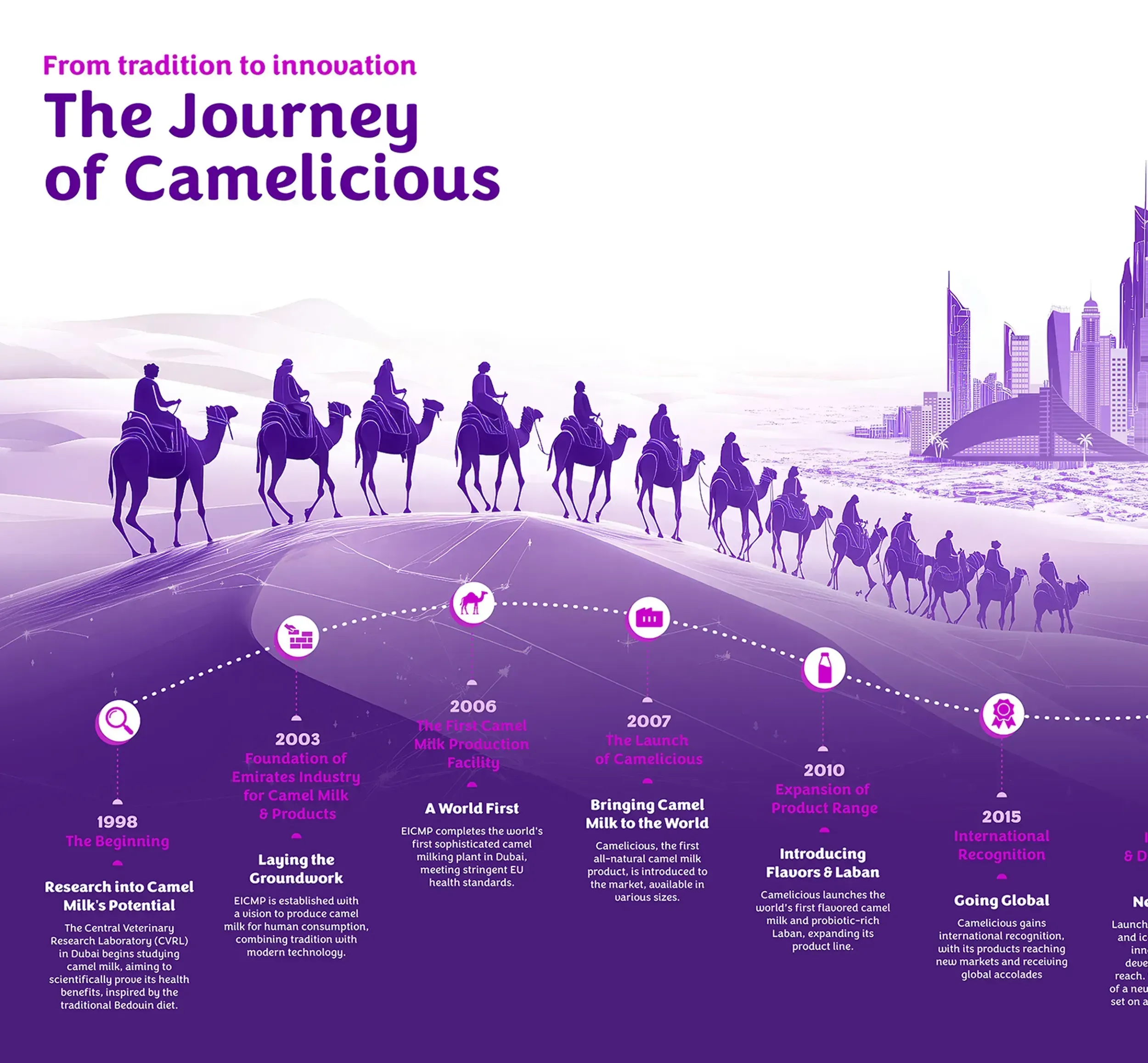
Get in Touch
    SK.Y.NE
    IN ARABIC سكاين

    [/Sk (ei) n/] noun

    Meaning: ‘To shine’ in the Frysian language. Frysian is the language spoken in the north part of the Netherlands, Friesland.

    ie: We make brands Skyne.

    • Our expertise
    • Get in touch

    Camelicious

    Rebranding a heritage brand into a modern global brand to attract new and existing customers

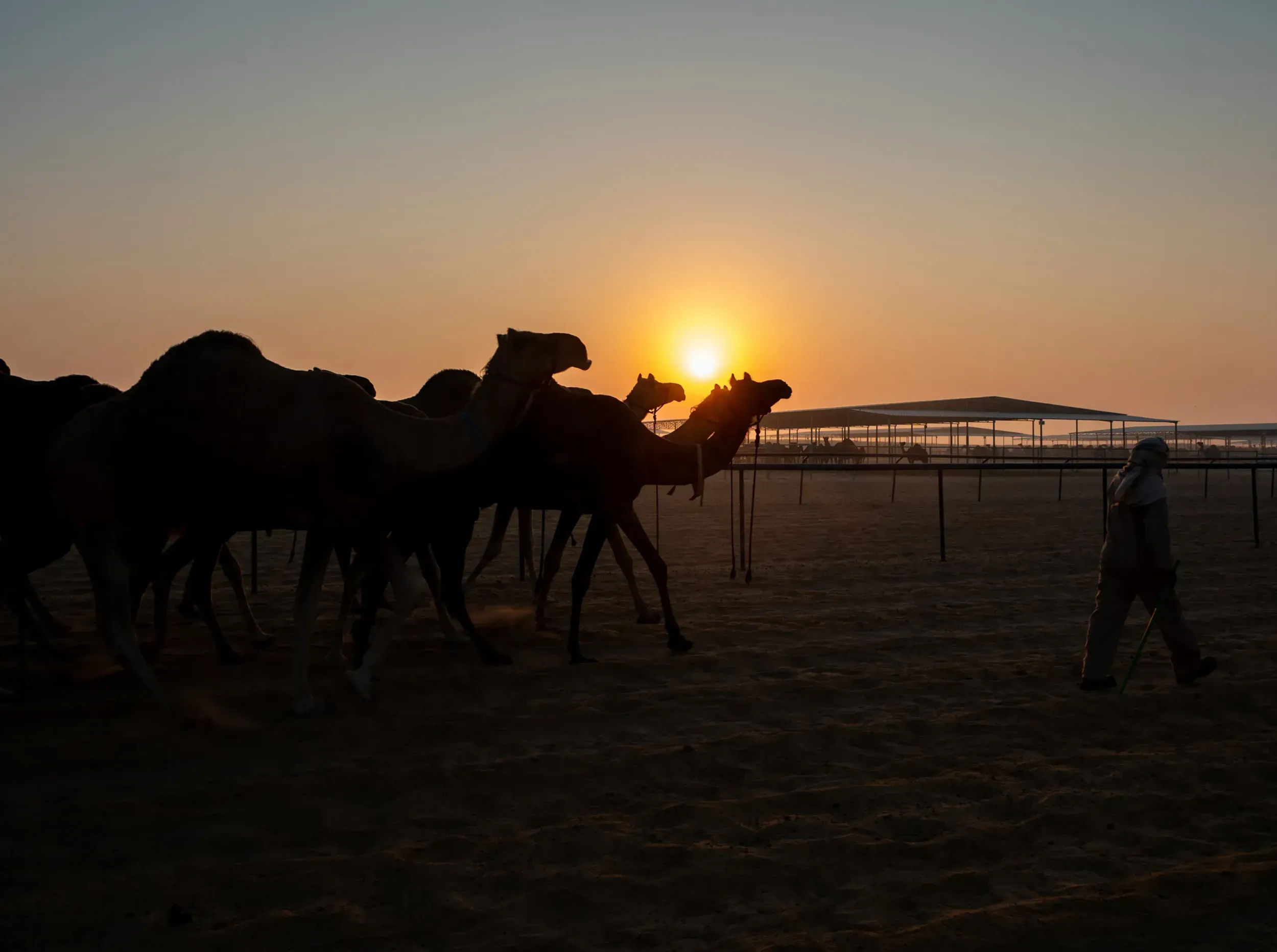
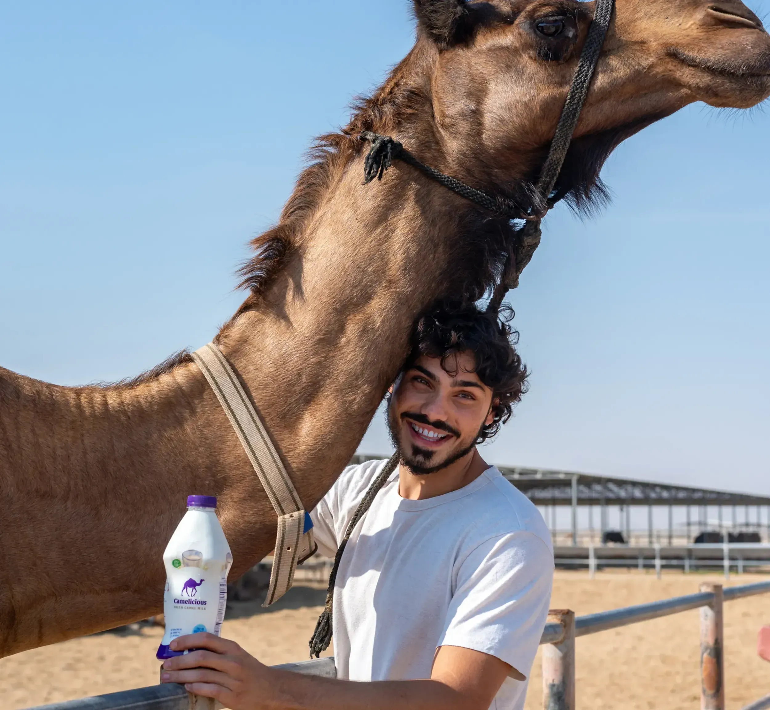
    Camelicious is the world’s largest camel dairy farm, based in the UAE and distributed across global retail networks. To reach new consumers while staying true to its roots, the brand needed to modernise, justify its premium pricing, and expand its appeal both locally and globally.

    Sheikh Mohammed bin Rashid Al Maktoum examining Camelicious camel milk products, highlighting the brand's premium positioning and Skyne's successful branding strategy for this superfood in the global market.

    The Shift

    Camelicious wanted to reposition itself as a premium superfood brand, proudly “Made in UAE” but globally relevant. The challenge was to shift perception, increase shelf visibility, and create a clear, modern value proposition, all without losing the cultural heritage that made it unique.

    The bold Camelicious logo with a camel silhouette on a vibrant purple background, designed by Skyne, a branding agency specializing in distinctive packaging design for FMCG and food products.

    The Breakthrough

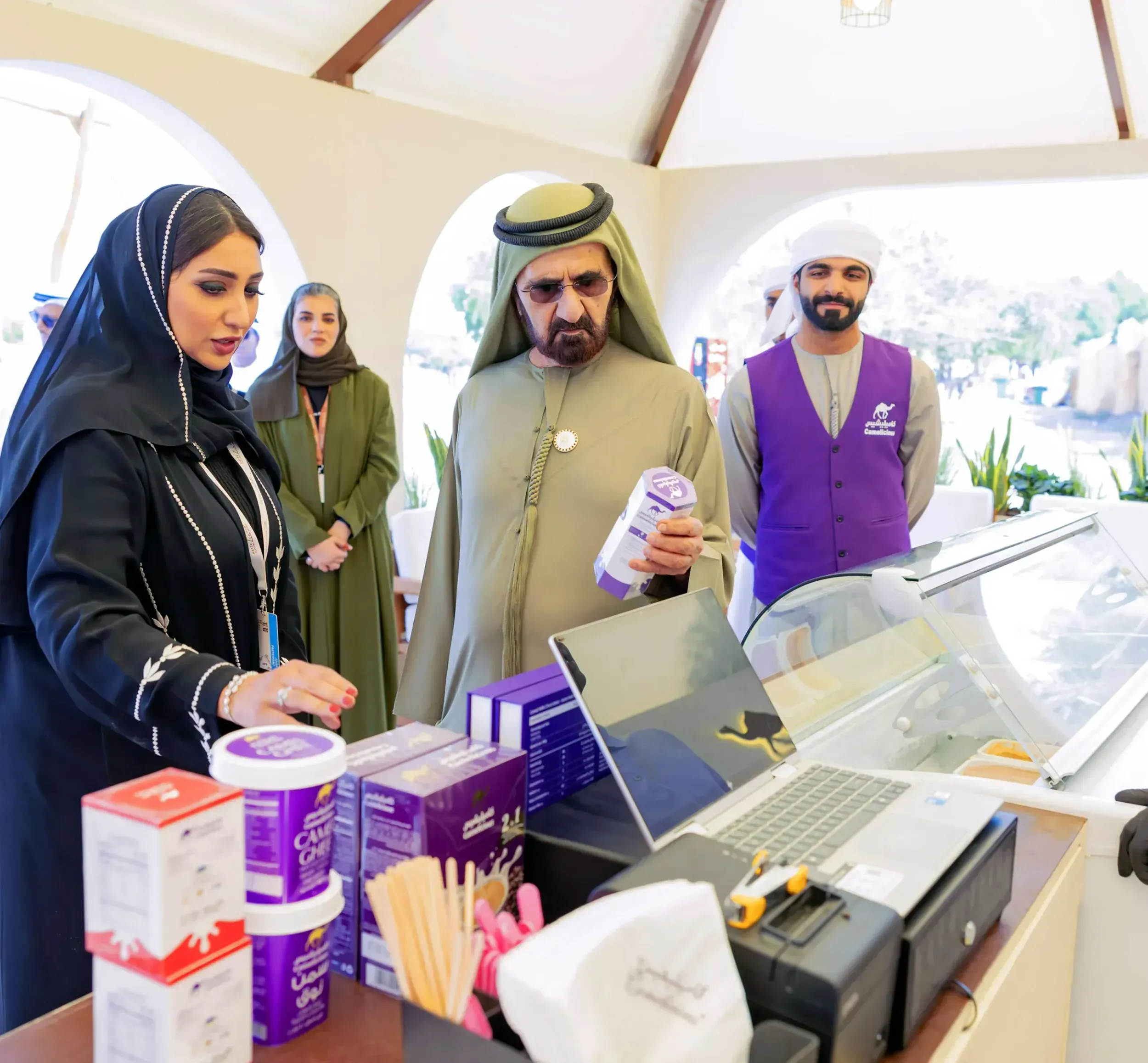
    A full brand and packaging transformation, complete with a go-to-market strategy. Within 26 days of launch, Camelicious saw a 14% sales increase and over 5,000% rise in impressions. The new identity resonated with both local and global audiences, driving visibility and growth across platforms.

    A diverse range of Camelicious camel milk products, including flavored milk and laban, demonstrating Skyne's comprehensive packaging design and branding for a healthy, modern food product line.
    01

    Reframing camel milk for the modern consumer

    The process began by identifying key hurdles: premium pricing, low awareness, and fragmented brand architecture. Through retail safaris, stakeholder workshops, and competitive benchmarking, we built a strategy that told the Camelicious story through quality, heritage, and sustainability.

    A woman holding a Camelicious camel milk bottle, emphasizing the product's appeal to modern consumers and Skyne's focus on people-centric branding for FMCG products.
    Camels walking across the farm at sunrise, representing the natural and sustainable sourcing of Camelicious milk, a key message reinforced by Skyne's branding agency expertise.
    A man smiling with a camel and holding a Camelicious milk bottle, showcasing the authentic connection to the product's origin and Skyne's ability to create compelling branding narratives for food and beverage.
    Various Camelicious packaging designs, including milk powder and ready-to-drink options, illustrating Skyne's innovative packaging design solutions for a diverse range of camel milk products.

    Our heritage is not a limit, it is a springboard from which to soar.

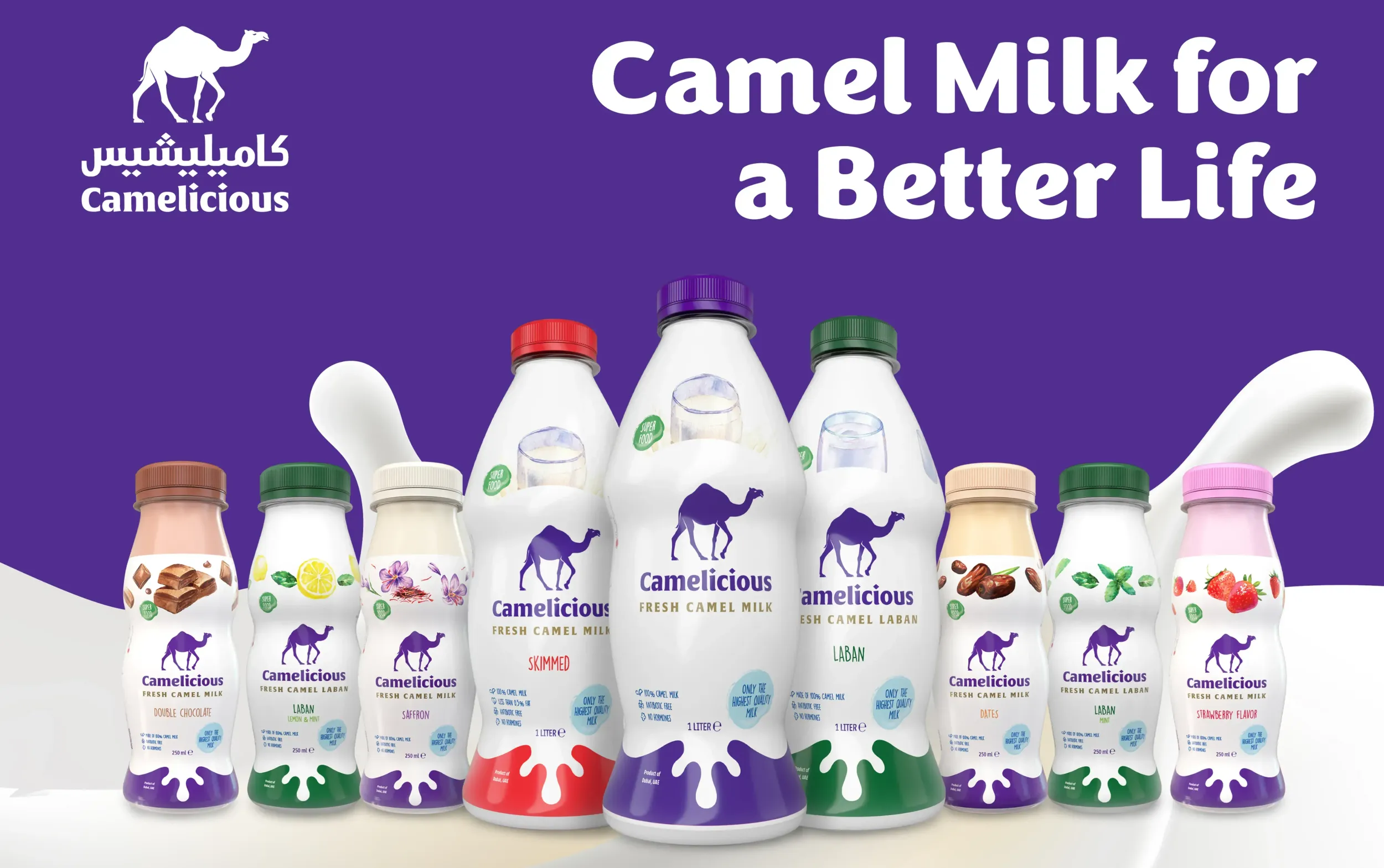
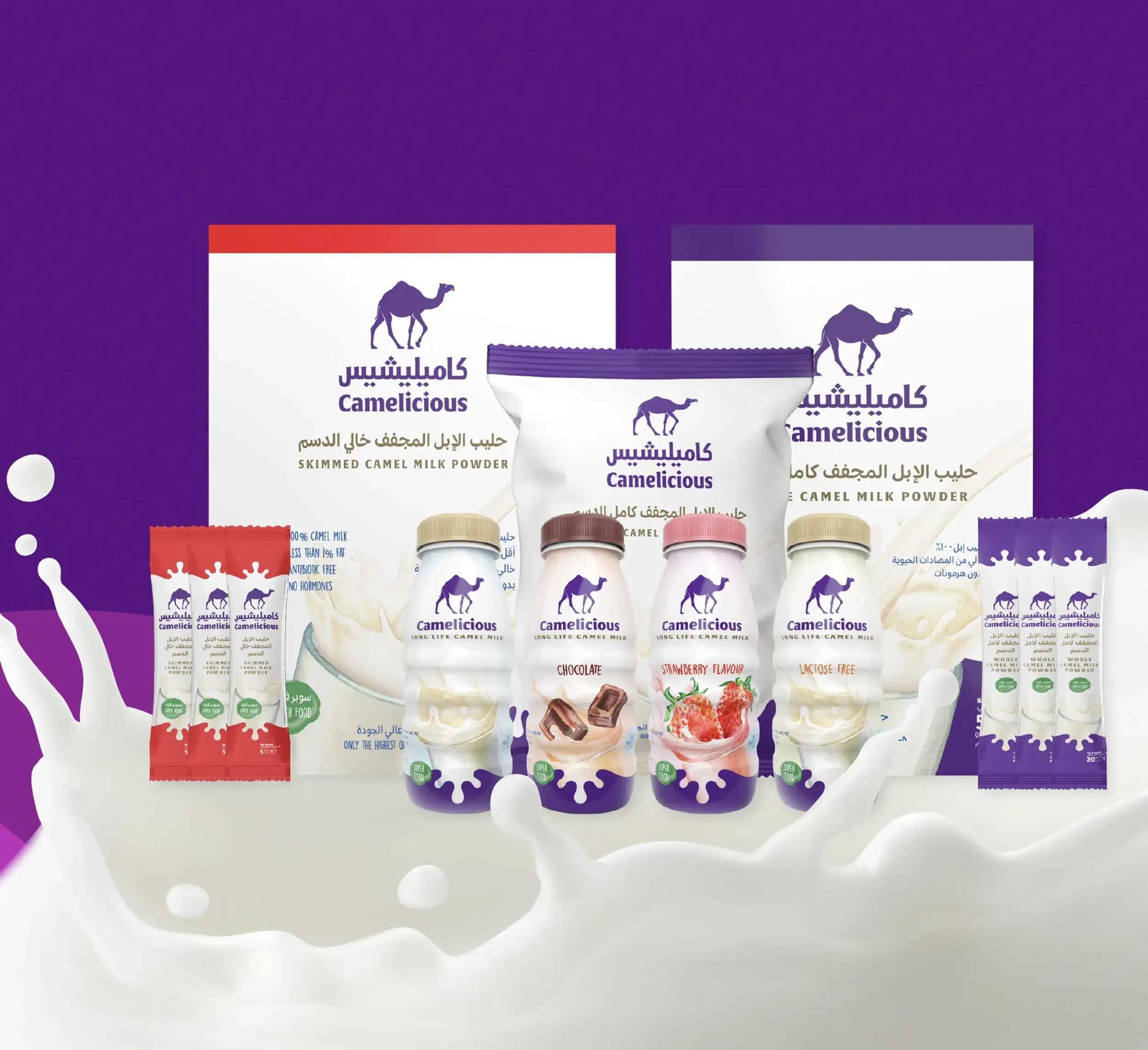
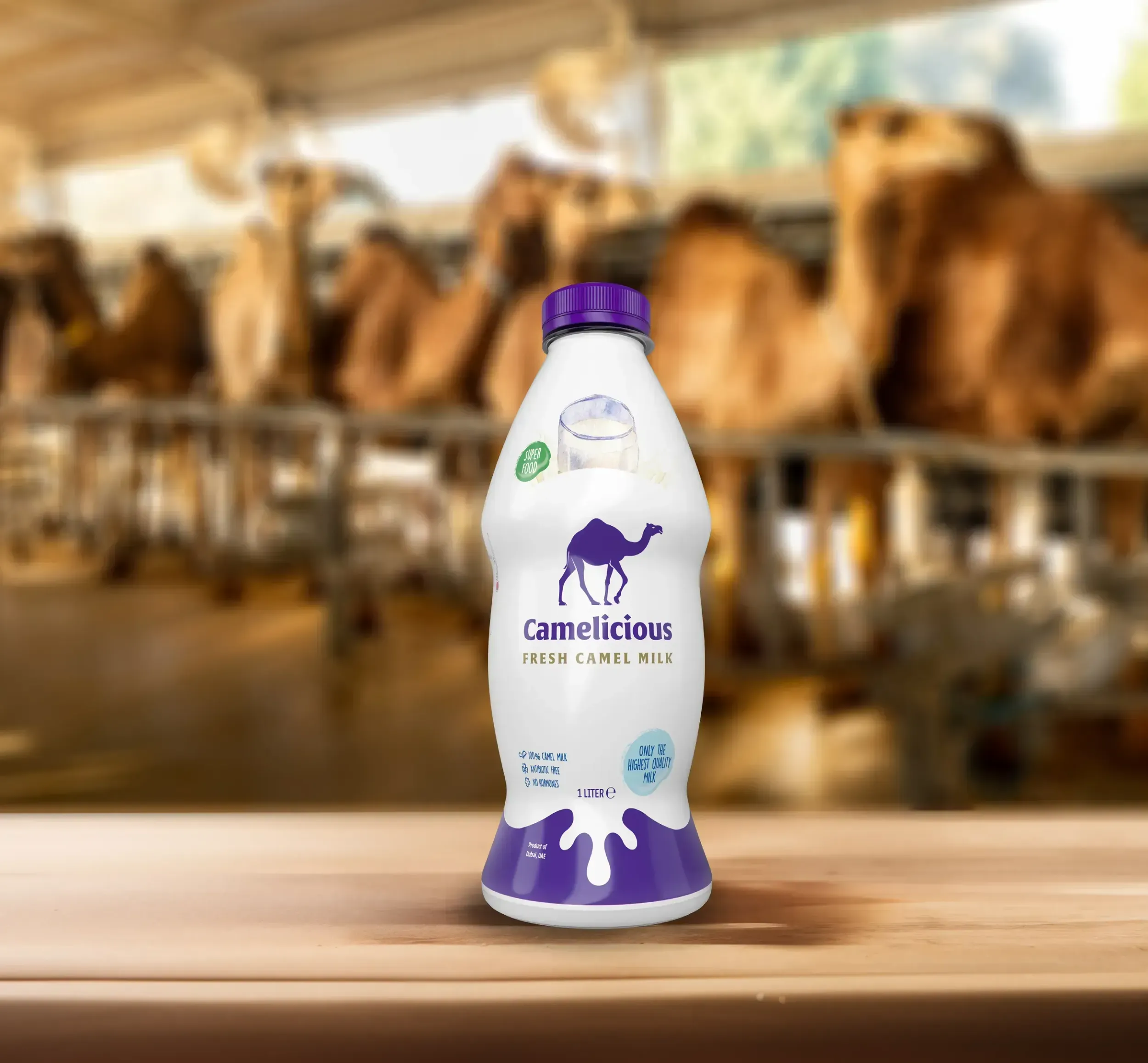
    Packaging that drives decisions at shelf level

    The brand identity and packaging system were redesigned to reflect premium cues while staying culturally grounded. The design drew from the desert dunes and Arabic motifs, with a unified structure across flavours and SKUs, ensuring shelf impact and consumer clarity.

    An infographic detailing the journey of Camelicious from tradition to innovation, showcasing Skyne's strategic branding and creative agency approach to brand development.
    An illustrative map of the Camelicious world, featuring various products and highlighting the brand's commitment to sustainability and innovation, a visual representation of Skyne's comprehensive branding.
    A bottle of Camelicious Fresh Camel Milk in a camel farm setting, emphasizing the product's freshness and natural origin, a key aspect of Skyne's branding for this premium food product.

    The brand identity and packaging system were redesigned to reflect premium cues while staying culturally grounded. The design drew from the desert dunes and Arabic motifs, with a unified structure across flavours and SKUs, ensuring shelf impact and consumer clarity.

    Purple tote bag with the Camalicious logo featuring a white camel icon and bilingual Arabic-English text, placed against a lavender background

    Launch strategy that converts awareness into sales

    The rebrand was rolled out with a robust go-to-market plan, including media, retail, and influencer activation. The result: 5485% more impressions, 209% more interactions, and 2,445 new followers in just three weeks, directly boosting awareness and engagement.

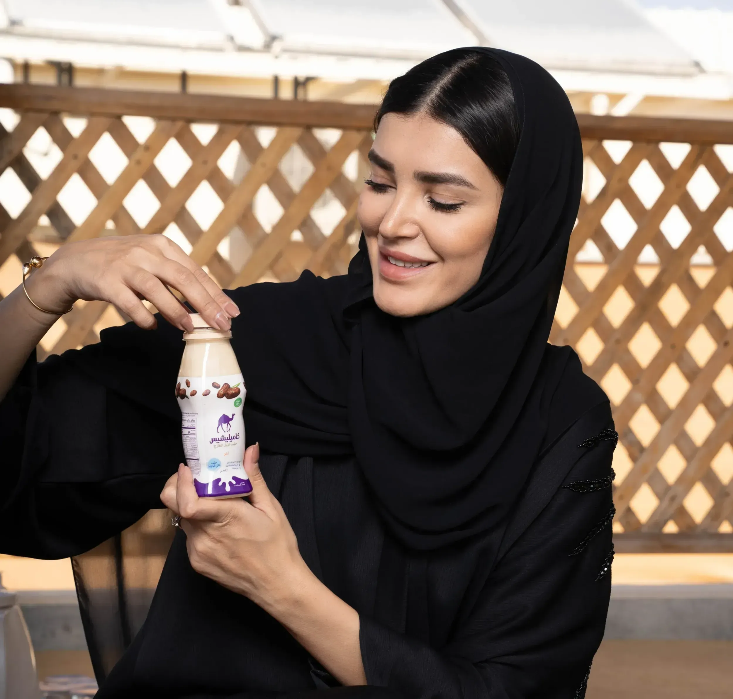
    Visuals that reflect premium, local and sustainable

    Elegant typography, rich colours, and natural forms communicate the brand’s modernity and heritage. Packaging materials and visual assets reinforced its premium positioning and health-conscious messaging, helping consumers understand and trust the value of camel milk.

    NEXT CASE
    Jotun
    0%