Pronk
Making Pronk’s Services Distinctive and Recognisable for Industry Leadership
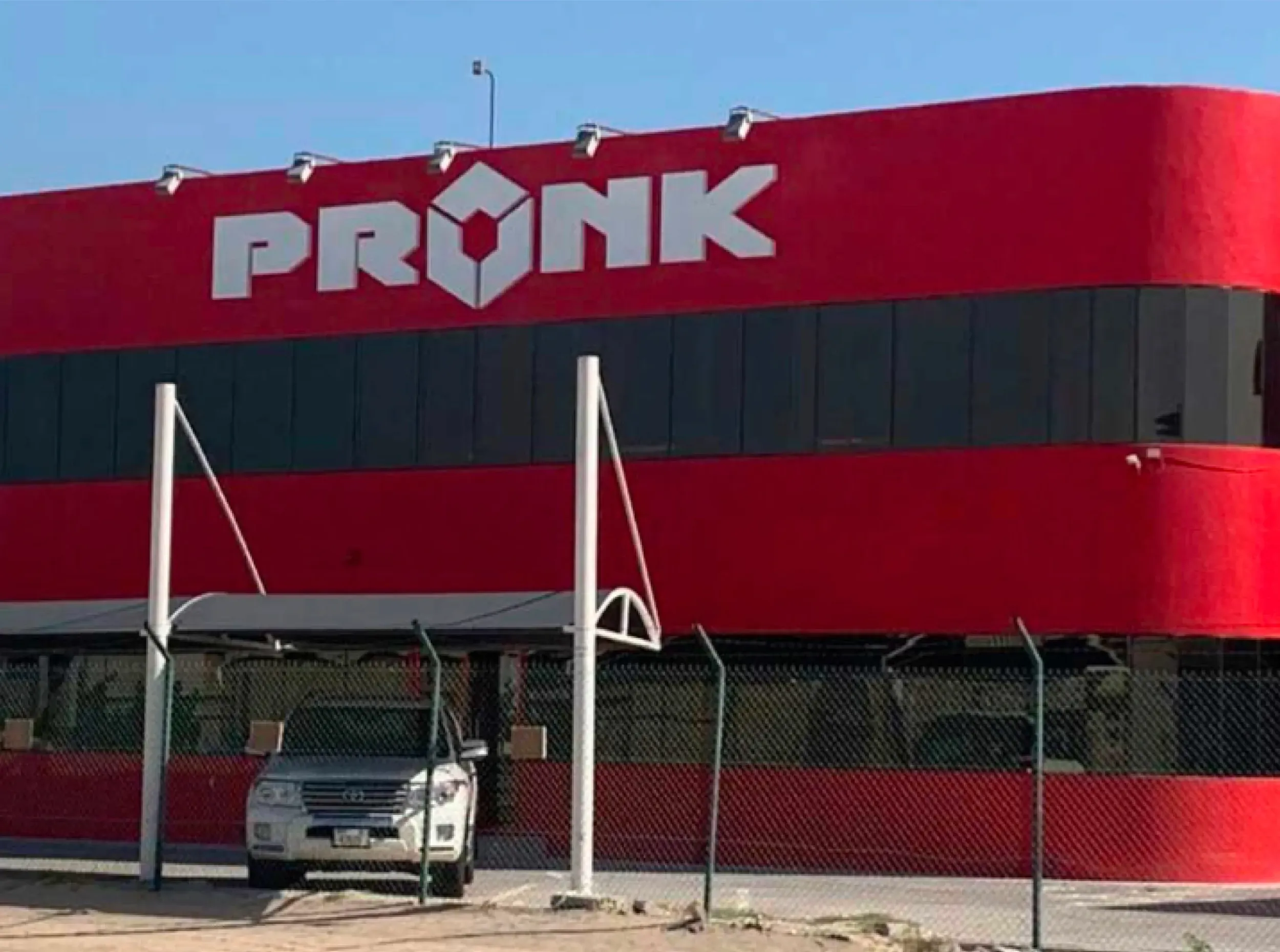
Pronk, headquartered in the Netherlands with offices in Amsterdam, Dubai, and India, provides packing, lashing, securing, and lifting services for valuable cargo. In a rapidly changing market, Pronk recognised the need for a stronger brand presence. One that would clarify its offerings to clients and employees and distinguish it globally.
The Shift
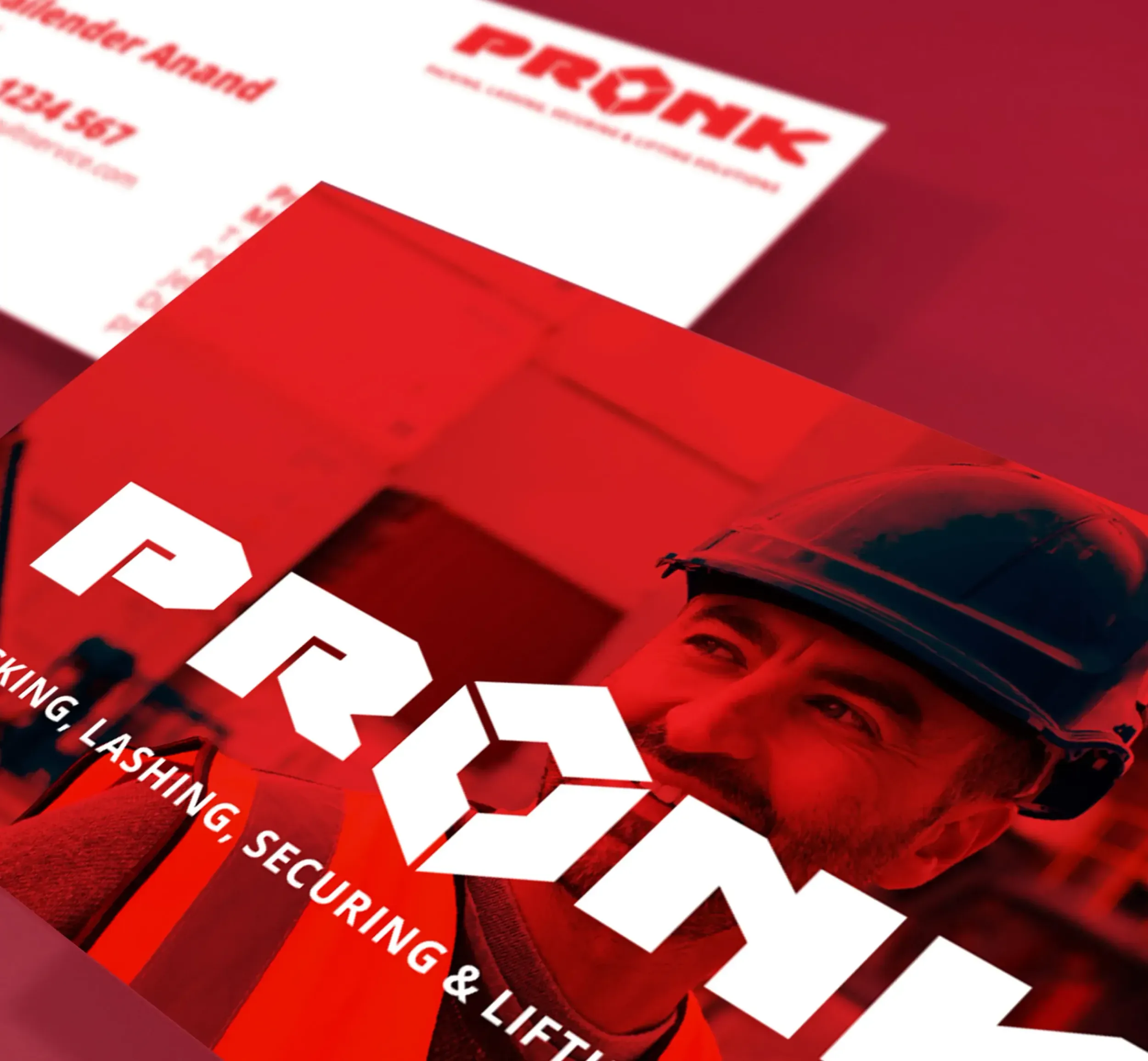
Pronk faced a critical challenge: how to bring clarity to its positioning across markets, making his services instantly clear and understandable to customers, while ensuring internal teams spoke with one consistent voice. The company needed a distinctive and engaging identity that resonated externally in a competitive market and internally across its global workforce. The shift included removing ‘Multiservice’ from the brand name, simplifying and strengthening brand recognition.
The Breakthrough
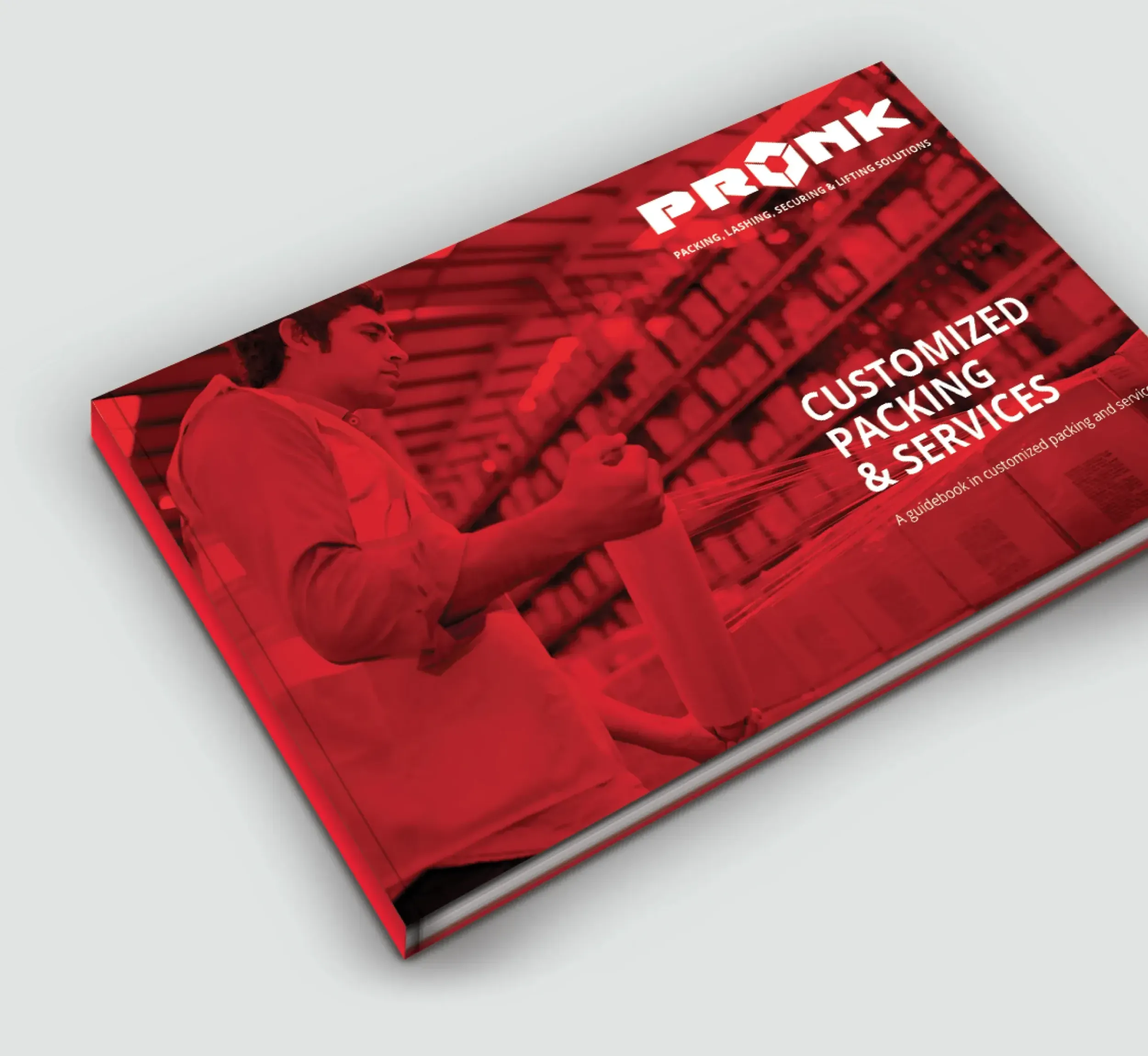
The key breakthrough was clarity. By removing noise and complexity from Pronk’s name, identity, and messaging, we helped Pronk present itself with renewed confidence and focus, making its promise unmistakable in every market. We developed a new brand strategy, identity, communication tools, and messaging for Pronk. The result: a brand built on clarity and consistency, with simplified messaging, and a consistent story for employees worldwide, a refined name, and a sharp visual identity that aligns with industry expectations and builds trust instantly. The shift included removing ‘Multiservice’ from the brand name, simplifying and strengthening brand recognition.
Market Research as the Foundation for Change
Skyne conducted extensive research into market dynamics, audience needs, and internal perceptions. Through customer interviews, employee conversations, and best practice benchmarking from logistics and adjacent industries, we identified how to make Pronk’s services more customer-focused, tangible, and discoverable online.
When you say everything, you say nothing.
Designing a Clear and Distinctive Identity
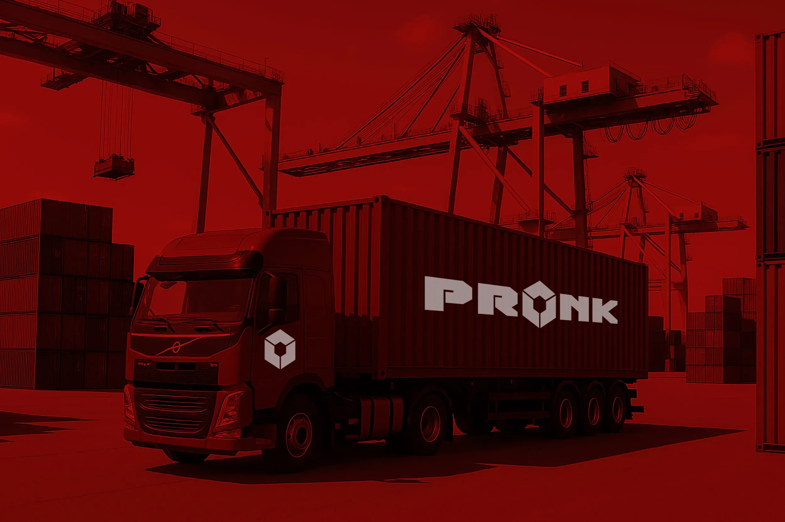
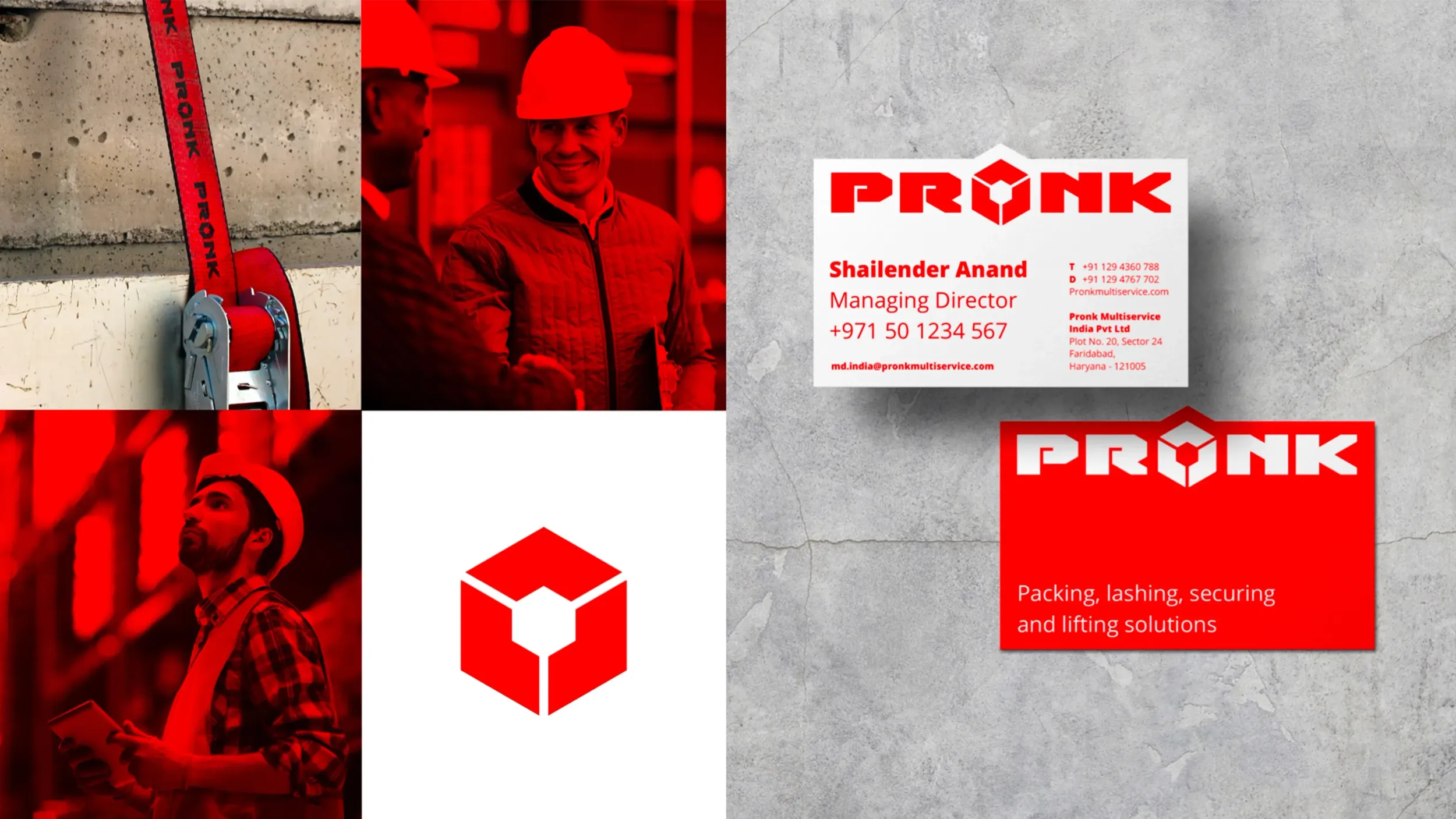
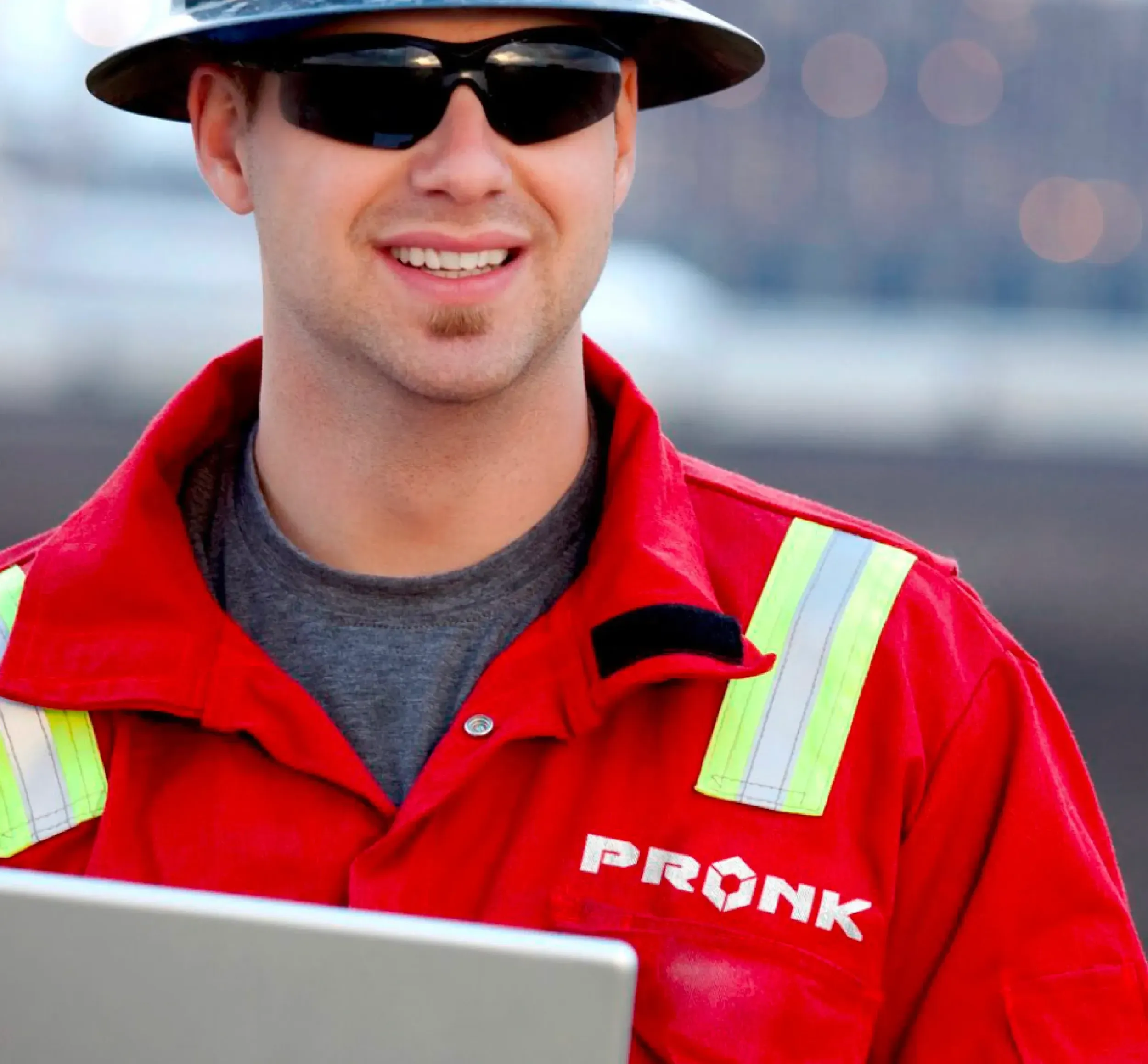
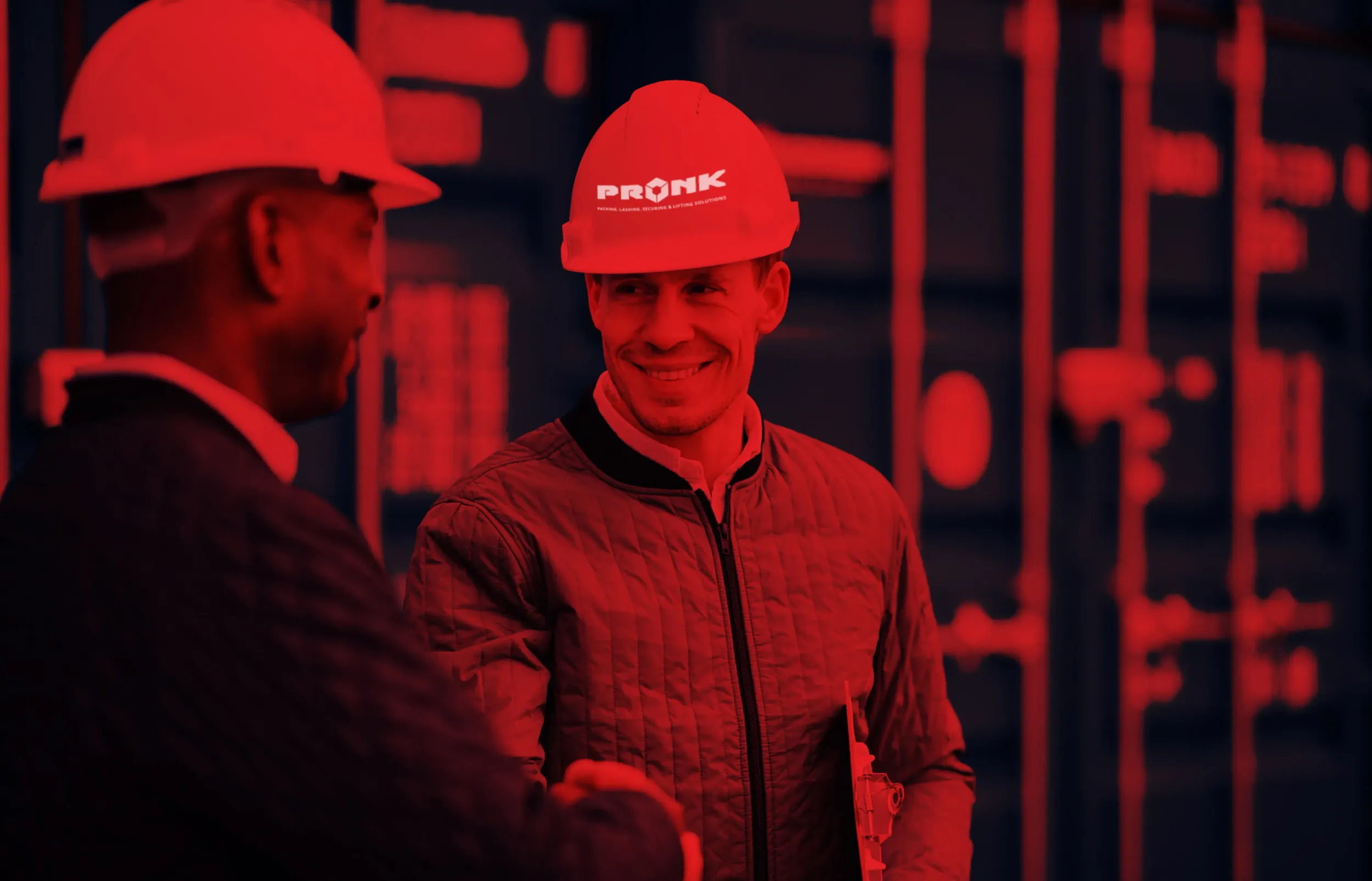
Starting from Pronk’s core values, safety, proactivity, and efficiency, we crafted a brand identity that clearly communicates the company’s promise at a glance. The new logo and concise, ‘snackable’ messaging brought clarity and relevance to the brand. This identity was applied across all communication tools, including a new website, where Skyne managed the full wireframes, UI/UX design, and build.
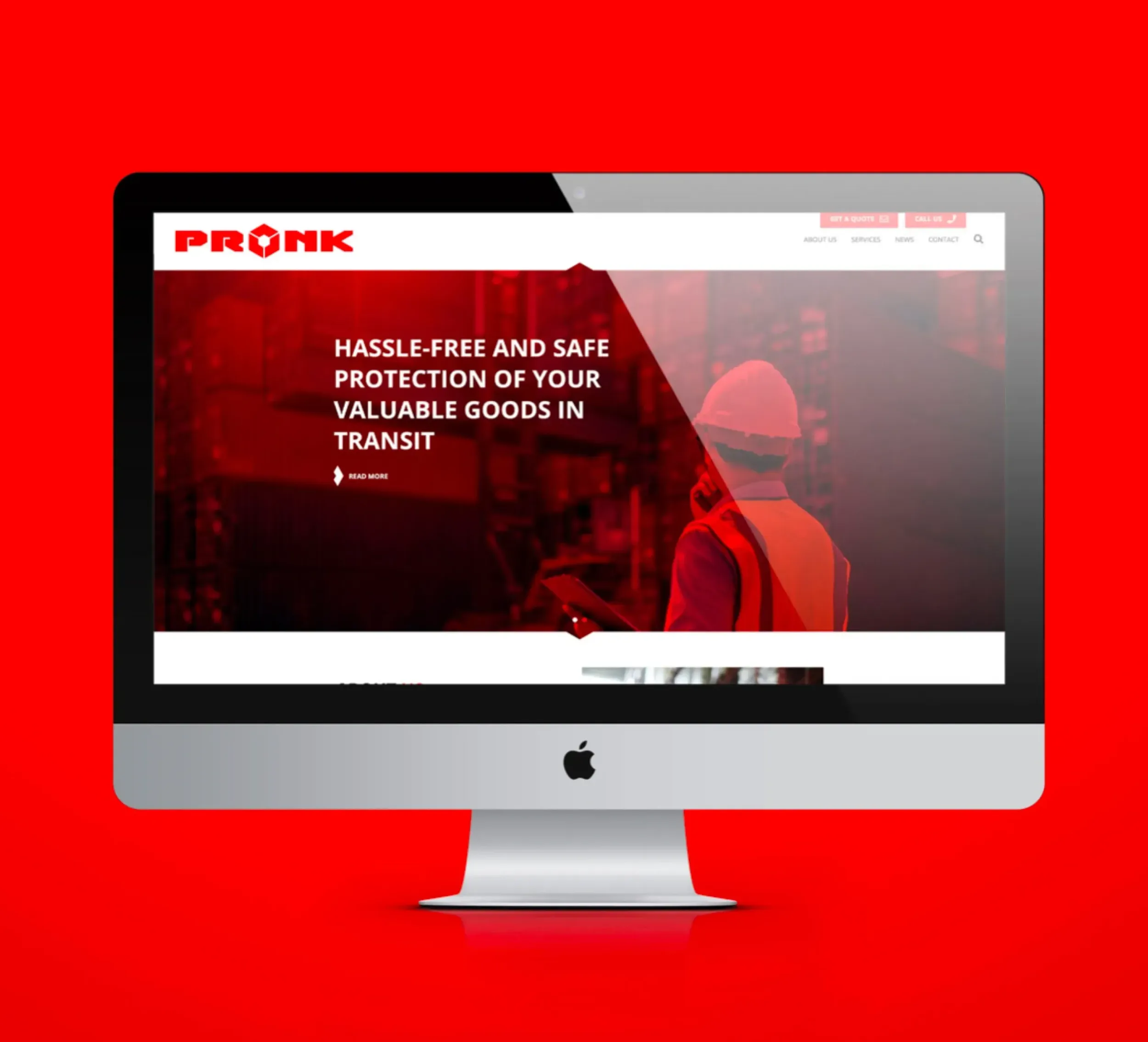
Starting from Pronk’s core values, safety, proactivity, and efficiency, we crafted a brand identity that clearly communicates the company’s promise at a glance. The new logo and concise, ‘snackable’ messaging brought clarity and relevance to the brand. This identity was applied across all communication tools, including a new website, where Skyne managed the full wireframes, UI/UX design, and build.
Marcel Pronk
Managing Director Pronk Dubai
Skyne’s strength lies in quickly mapping the opportunities for your company and translating these into a strategy for your brand. The team guides you along the way.

Siegrid Althuizen
CEO
Working for Pronk was an adventure. The client was convinced he had no need for a creative branding agency. It was our task to explain the importance of what we do. Fast forward to now and Pronk is the biggest ambassador for Skyne. The owner understands the value we bring, with his brand now being proudly displayed everywhere.