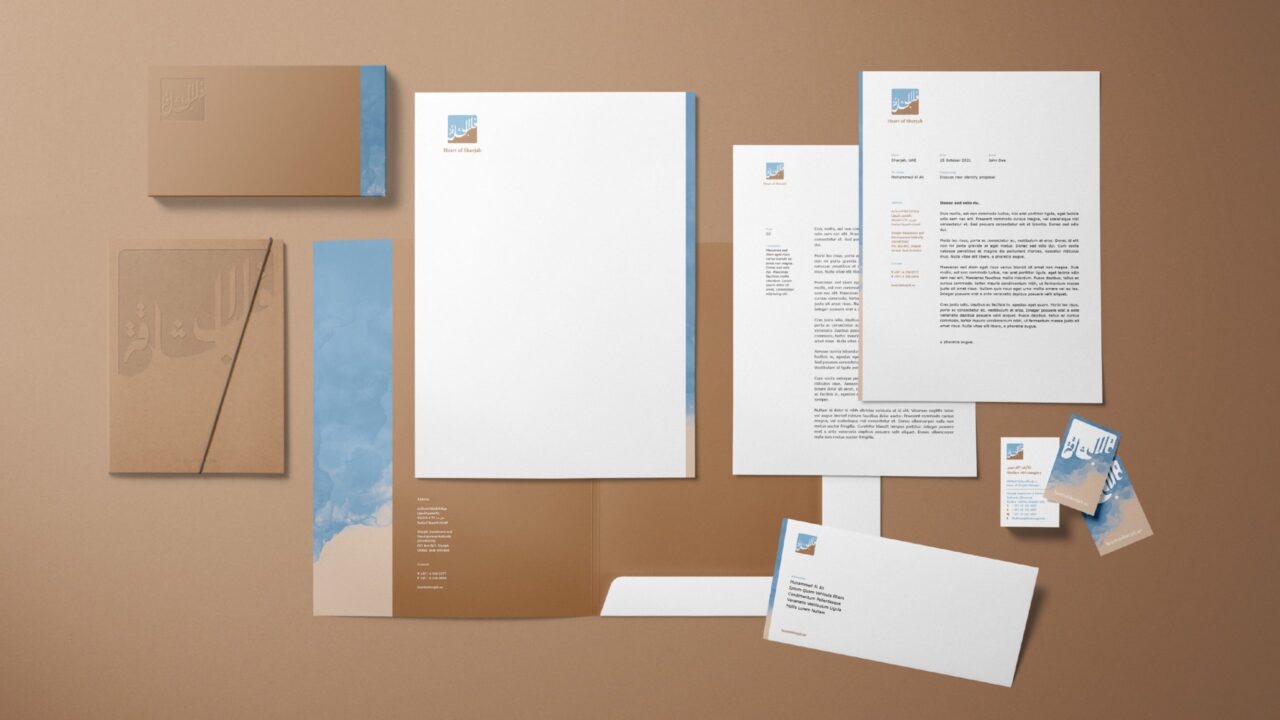
Heart of Sharjah is the ultimate cultural destination for tourists and visitors looking to experience the rich history and heritage of Sharjah. While Heart of Sharjah boasts a beautiful logo design, the rest of the brand identity is quite corporate and rigid for what the destination stands for. Skyne was asked to revisit and update the identity, create a more expanded style, and apply it to the collaterals in a way that suits the true personality of Heart of Sharjah. The result? A modern and distinctive look & feel, yet rooted in culture.
 MODERN DESIGN MEETS CRAFTSMANSHIP
From a corporate to more engaging B2C brand identity
After gathering insights and opportunities we organized a workshop with the Heart of Sharjah team. The purpose of this workshop was to jointly further explore the do’s and don’ts, the current and future brand position, the assets that needed to be changed et cetera. During the workshop, we concluded Heart of Sharjah needed to move from a corporate (B2B) appeal towards a more engaging B2C identity, as it was time for Heart of Sharjah to start attracting consumers instead of investors. Furthermore, it was important to stick to Heart of Sharjah’s roots of culture and heritage, yet have a modern and distinctive look & feel.
Our designers then updated the logo by improving its key features and adding more depth and craftsmanship. The colour palette and visual style were also reviewed and modified. From there, we developed all collaterals, including business cards, letterheads, PowerPoint templates and more.


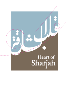
Old logo
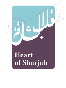
Initial concept
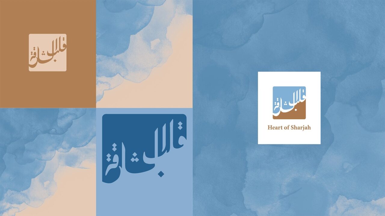
Final logo
The Arabic text of the old logo was aligned and changed into a more positive upward motion, ensuring an ‘optimistic feeling’. Furthermore, we improved readability and spacing, created more balance and equality in all letterforms and the Latin text was enlarged. The colour palette was updated and we improved the adaptability of the logo for digital media.

