Now more than ever, when we look at branding a government, there’s one overarching truth: a well-structured brand architecture is greatly important to bring clarity out of complexity. Governments are often a labyrinth of services, departments, and entities, each with distinct functions and audiences. Without a cohesive brand structure, this complexity leads to confusion, both internally and for the public. But, with the right architecture in place, these diverse entities can work together under a unified identity, empowering governments to deliver clear, consistent, and effective communication.
1. Clarity is key
When we look at a government’s brand architecture system, we have to understand it isn’t just about logos and color palettes; it’s about organizing chaos in a way that citizens can easily understand. Governmental organisations have so many people-facing entities, it is a momentous task to take those entities, and create a system that means something to the people. Using design in a strategic way to give utmost clarity.
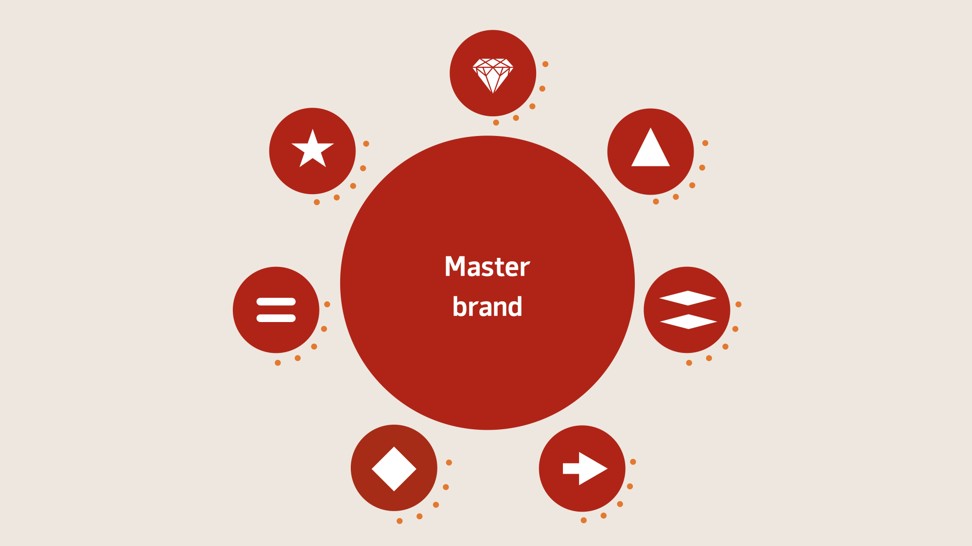
Take the example of the Queensland Government and their “Solar System” model. The master brand is the “Sun” at the center, with other entities orbiting around it, connected by strict visual guidelines. This external, audience-first focus ensures that citizens can navigate government services without feeling lost.
At the heart of this is the idea that a government’s visual identity must always prioritize clarity and perception. The audience, or citizens, must always be able to identify, understand, and trust the brand behind the services they engage with.
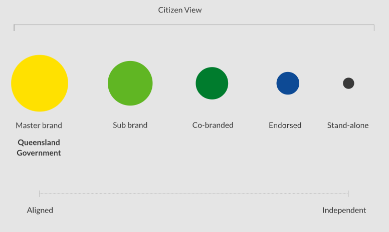
The brand architecture is organised with an ‘outside-in’ approach, where entities are structured around public perception. That said, it’s not to be confused with or replace the internal organisational structure.
The Queensland Government Brand (master brand) is the ‘Sun’ at the centre. Closely aligned brands to the ‘Sun’ will have a stronger connection and more commonalities with the Queensland Government brand.
Less closely aligned brands to the ‘Sun’ will share some commonalities with the Government brand but be able to add their own elements to cater for a specific audience or messaging.
2. Simplification through unification
A great example of unifying entities is the Netherlands, where the government faced an identity crisis with 175 institutions operating independently, leading to fragmented communication. The solution? The all-for-one approach, where a single master brand unites all entities through a simple “blue ribbon.” By reducing the number of competing voices and establishing a single, clear visual language, the Dutch government not only saved on costs but also created a more cohesive dialogue with its citizens.
Simplification and unification are paramount in any brand architecture, especially when talking about complex government systems. The goal isn’t to erase individuality but to bring it under a common structure where every part has a place and a purpose.
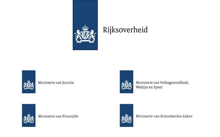
The Dutch government brand identity was not concise or consistent, with over 200 departments and ministries costs were rising of each department having their own logo, typeface, print materials, signage and everything that involves the visual communication of that department. There was not a direct link to society and confusion about the identity in which the government wanted to present itself.
Project 1 Logo was born to bring back all brand identity of the Dutch government and give one signal to society about what the government stands for.
3. Differentiation with consistency
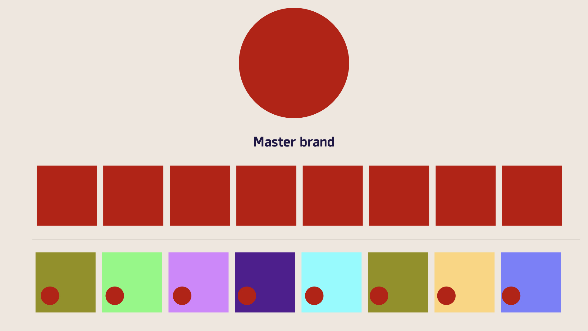
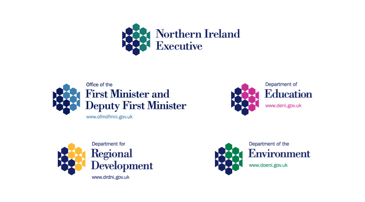
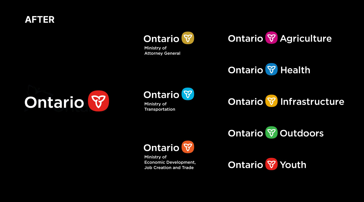
Unification under one banner doesnt mean we lose differentiation. One of the great examples of this is Northern Ireland and Ontario governments who opted for a more flexible approach by using color-coding to differentiate between departments while still maintaining a consistent overall brand identity. Each entity has its own distinct look, but they all connect back to the master brand. This approach reinforces the importance of creating space for individuality without sacrificing overall unity.
Skyne’s approach: building personalised brand architecture models
Working with distinct government entities, we have to make sure our process is rooted in a deep understanding of specific needs, contexts, and audience perceptions. Analyzing existing structures is of the utmost importance. How are the entities structured in relation to one another? Are there any political reasons at play? How do we make this functional whilst making sure department heads are also in line with the overall vision?
Each government will have a different answer (and maybe even entirely new questions), what works for one might not work for another. Therefore, personalization is key. We assess the criteria of each entity to tailor the brand structure to fit not just the government’s goals, but also the citizens’ expectations. This involves identifying where differentiation is needed, where unity should be prioritized, and how to create a brand system that offers clarity and flexibility.
For instance, in some cases, we may choose to emphasize individual identities within the government framework, creating distinct identifiers through typography, color, or icons. In other cases, we could develop unifying visual elements that connect various services or departments under a central master brand while allowing for enough distinction to avoid confusion.
Ultimately, the solutions we propose are adaptive, not fixed. They are built to evolve as the needs of the government and its citizens change, ensuring that the architecture grows with the entities it supports. Our approach fosters a balance between cohesion and individuality, enabling governments to operate with clarity, simplicity, and purpose.
