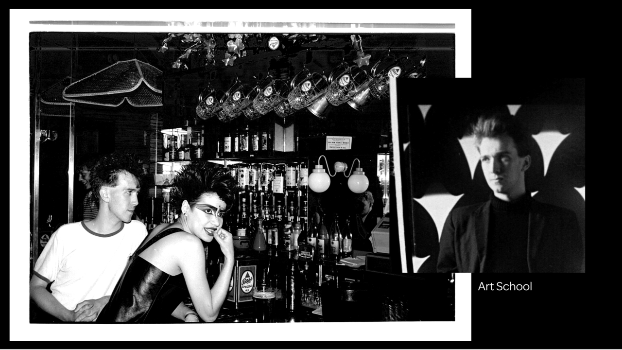
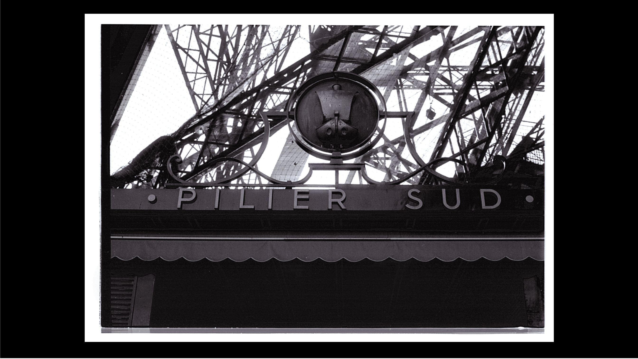
I left home in Glasgow at 17 years old and enrolled at Grays School of Art in Aberdeen in 1978. It was the days of Punk Rock, so everything was exciting, and rules were for breaking. Keen to experience ‘everything’ I travelled abroad, by boat, to Paris in 1980. Here I discovered that everyday things were considered and beautifully designed, especially typography. I took hundreds of photographs of the Art Nouveau Metro, SNCF station signs, the lettering on the pillars of the Eiffel Tower and a multitude of typographic expression.
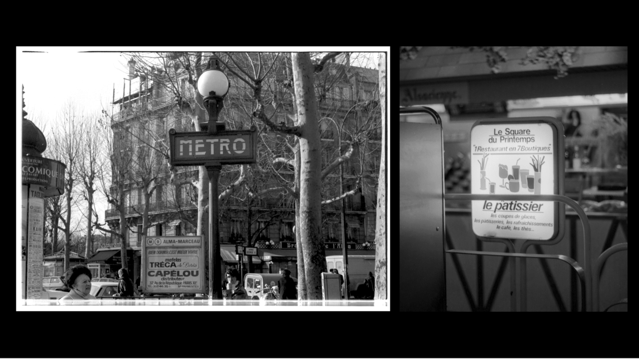
This typography was not simply functional, you could see the designers really thought about what they were creating - they cared about it. Today, I constantly take this approach during the creative process, as was the case with our work for Hinu, which is nominated in three categories in the Transform Awards MEA, one of which is ‘best use of typography’.
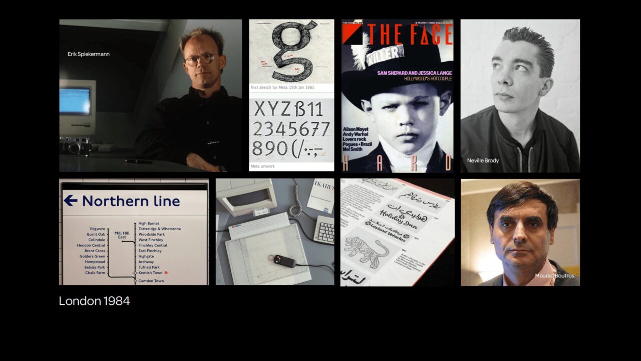
I graduated in 1982 and got my first job in London with Mike Daines in his new ‘digital’ typography studio. Mike was the editor of Baseline magazine, an internationally renowned publication which featured the best typographers in the world. Through him I was introduced to the world of typography and the ‘superstar’ typographers of the day. We were fortunate to work with Erik Spiekermann, Neville Brody, Mourad Boutros, David Quay, Freda Sack and many others. They all came to our studio during the 80’s in London. It was one of the places where commercial digital fonts originated.
I continued to travel around the world and still taking photographs, I captured the unique ways different cultures communicate, through typography and design. Today, it’s easy for us to search for inspiration online, and it’s extremely useful, but it’s a uniquely different experience to physically search for and curate these little details when you’re actually there – creating your own vault of visual references.
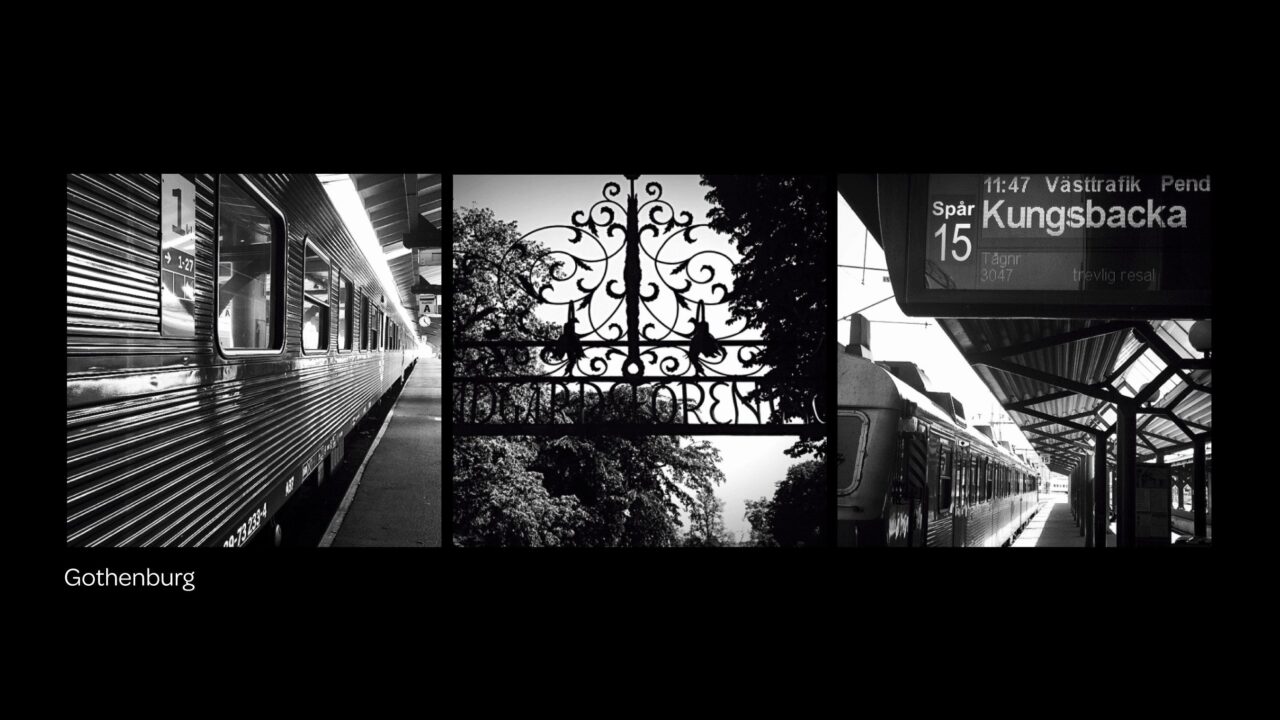
In Gothenburg, a city with a rich design history, I noticed that typography and communications were carefully considered and designed for their specific purpose – from public parks and buildings to the transit network.
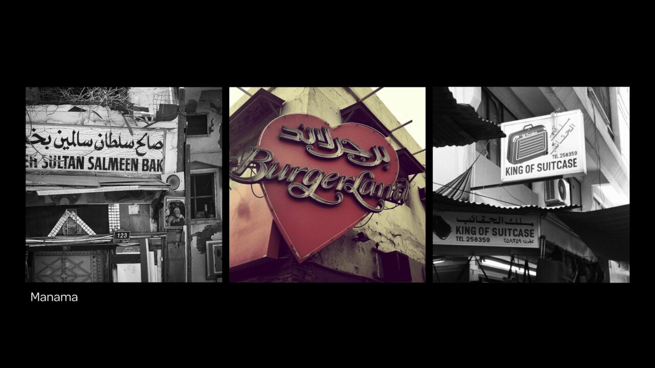
Where Gothenburg had design systems, Bahrain was the complete opposite. A beautiful chaos of clashing Arabic design styles and typography that fought for your attention – from tailors and tea pots, to suitcases and spices. This added to the rich visual language of the streets.
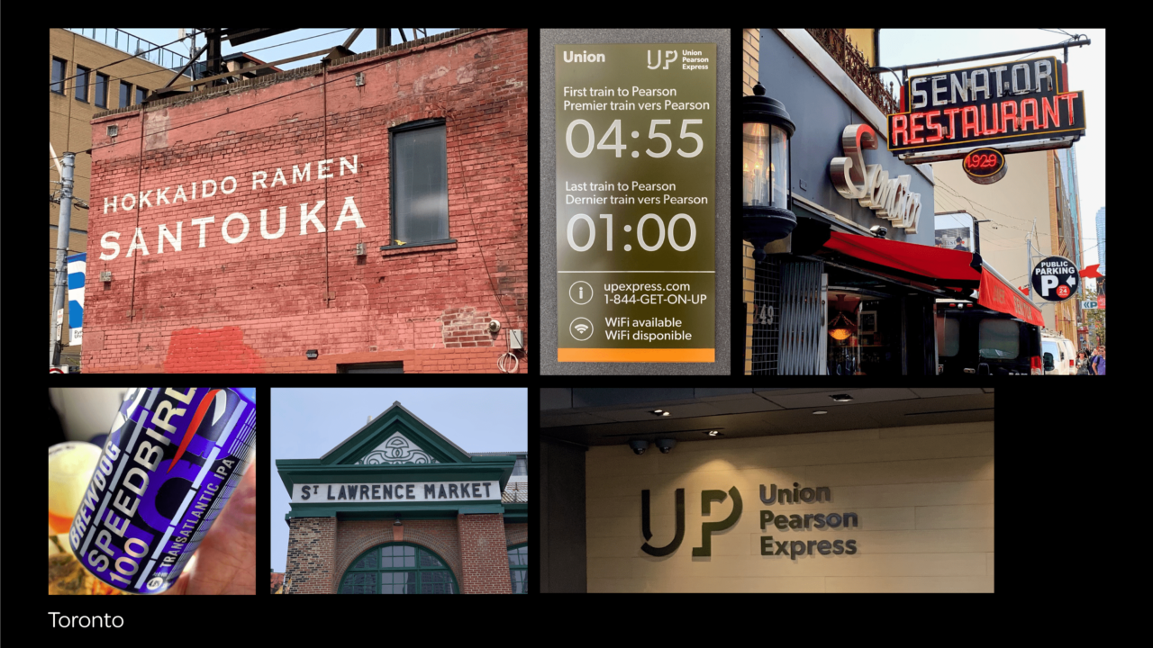
In Toronto, the city exuded a sense of fluidity, it felt adaptable and progressive. The design and typography of the city reflects its own unique character. This was evident in the welcoming and rail inspired identity for the Union Pearson Express, to the authentic and brilliantly hand-drawn brick wall signage of ‘Hokkaido Ramen Santouka’ in the centre of the city.
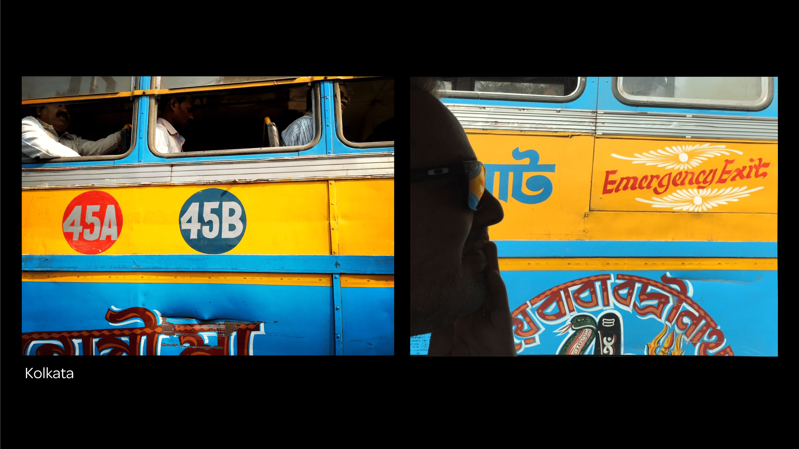
Before the Covid outbreak, I visited Kolkata in India. It was an assault on the senses.
The city was a massive swell of people, with many diverse social activities taking place 24 hours a day. The main thing I noticed was that colour was everywhere. Buses in Kolkata have super vibrant colour palettes, large hand painted numbers and lettering which are incredibly decorative. Passengers can recognise their particular bus from hundreds of meters away. The drama was unbelievable, but amazing to experience – and it all works!
When working on our Hinu project in Oman for branding agency ‘Skyne’, I recalled my past visits to Oman and the experience of the place and its people. This experience is something that you can only get by being there and feeling it. I’ll continue to collect design inspiration from around the globe, just as soon as it’s safe to do so.

