Al Farasha
Adding life to Sudan’s most trusted food brand

Client:
Morouj Commodities
Challenge:
Creating a line of supermarket products for the sudanese brand that is immediately trusted and integrated into the market
Result:
A new naming and design system for the brand, with a rejuvenated identity and packaging that stands out on shelves.

The taste of home:
Al Farasha
Al Farasha is Sudan’s most trusted food brands, a name that can be recognised in nearly every home in Sudan. A product range from Morouj Commodities, it has become A symbol of stability for the people in the region, Al Farasha fulfils essential needs and provides a wide range of food products of the highest quality. Products families can trust with their eyes closed.
From smooth tomato paste to organic lentils; from fine flour to tasty sauces, Al Farasha’s wide ranging products are all united under one name: Al Farasha.

FROM INSIGHTS TO STRATEGY
Leverage a name people have come
to know and trust
Al Farasha started as a tomato paste product. Where the people of Sudan knew the brand for its tomato paste. A unique challenge arose when Morouj decided to expand from their tomato paste brand to various other super market products.
To diversify their product range and still maintain brand equity, Skyne’s advice to Morouj was to use the equity the “Al Farasha” name provides and utilize it to name all future commodity products. This would create:
- Customer recognition is strengthened with one brand
- Ease of introduction for new products
- Enhances credibility, in turn creating ease of purchase for consumers
- Creates greater customer loyalty with the shared values of a single brand
- Marketing is made easier and more efficient when it is just one brand
FROM STRATEGY TO DESIGN
The butterfly effect
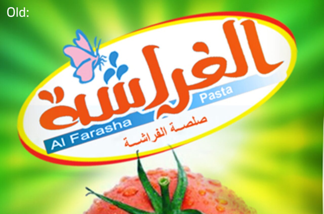
Before starting the design process for the Al Farasha design system, we analysed the current packaging and there were a few things that stood out to us.
- The logotype with its inconsistent flourishes and details is not very impactful, feels out of date
- English subscript should be integrated, and be similar in style as the Arabic logotype
- The butterfly that is part of the logo is currently a minor detail but could be an iconic point of recognition and design tool
- Holding device is not impactful or iconic, needs to be turned into a clear system or disappear
STRATEGY TO DESIGN
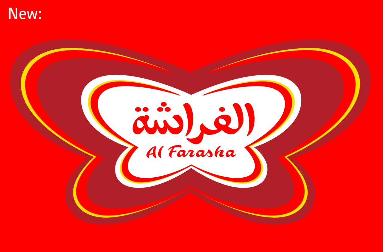
Towards a new opportunity
- The butterfly as the hero
- Modern & lively take on Arabic calligraphy
- Brand consistency
DESIGN TO PACKAGING
Shelf impact with any shape
Once the visual language of the butterfly was created based on the criteria for the logo we moved towards packaging aspect. Analysing the sudanese market and the shelf impact there we came to an interesting conclusion. Almost all of the commodities displayed in shelves in Sudan are see through. Furthermore, the packaging was not consistent across supermarkets in how it is displayed. Some were stacked on the side whilst others were top to bottom. This suggested a need for the packaging identity to be functionally visible from all angles.
A unique colour palette was selected to build contrast with the shelf and the products around it. Making the packaging visible from all sides and allowing it to stand out boldly.
DESIGN TO IMPLEMENTATION
Launching the Al Farasha brand campaign
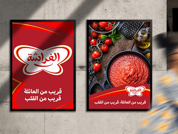
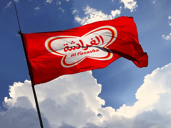
Al Farasha now needed a launch campaign, something simple, bold and bright to generate awareness around their new identity launch. Making the evolution of the butterfly visible and understandable to the target audience. We strived to stay away from images or stories in order to not overcomplicate the message. The message was simple and straightforward in its presentation: Here is Al Farasha and this is how it transformed from its past version.
This is how it was conceptualised by Skyne across various touchpoints.
Al Farasha in action: See the stunning campaign stunt that caught eyes and hearts in Khartoum
How we helped Al Farasha create an intimate connection with their people
Research & Analysis
Brand opportunities
Strategy & Story
Brand naming
Brand positioning
Brand story
Guiding principle
Concept & Design
Brand identity design
Brand collateral design
Communication tools design
Brand guidelines
Packaging design
Implementation & Activation
Project management
Collateral production
Campaign concepts
“Skyne is a very professional agency, committed to timelines, understands the client and the objective they are seeking. They deliver a project with an utmost standard of creativity.”
– Shahd Shakir Basta Shakir
Senior Marketing Manager
“The Al Farasha team were on board with what we suggested, their support and their willingness to let us explore proved to be the ulimate ingredient in the recipe for the new Al Farasha brand”
– Roel Vos, Partner Skyne

