Arch Capital
Developing a trusted brand for the only independent multi-family office and wealth manager in KSA

Client:
Arch Capital
Challenge:
Arch Capital required a brand strategy, brand story, brand identity, and website to develop a trustworthy Middle Eastern wealth management brand with an international appeal.
Result:
A new brand strategy, brand positioning, brand story and new brand identity, including a brand new website, presenting Arch Capital in the best possible way to their target audience.
Arch Capital,
Institutionalizing Wealth
Arch Capital is the only independent multi-family office and wealth manager in the Kingdom of Saudi Arabia that only acts in your best interest, with the purpose to efficiently structure wealth and assets on behalf of Middle Eastern families and businesses to deliver sustainable value, ensuring long-term growth and succession in the region.
Providing trusted advice, bespoke services and solutions, Arch Capital is driven to help wealthy families and businesses in the Middle East achieve their goals by structuring their wealth in a more efficient way, helping them increase their returns and reduce costs while lowering their risk profile.



PROJECT SCOPE
Establishing a trustworthy wealth management brand
To establish a wealth management brand that communicates the desired values and information to potential clients, Arch Capital required a brand strategy, brand story, brand positioning, brand identity and brand new website. Skyne was assigned to realise this ambitious goal by developing a new brand for Arch Capital, that would be launched soon after and is to be grown for years to come.
The brand strategy needed to be communicated and shared via a user-friendly website that informs and engages the target audience. For the design and build of the website, Skyne researched the best trends for UI and UX in the market and created the sitemap, wireframes, UI and UX and the concept design.
PROJECT SCOPE
Carving out a specific niche for the market
Through deep market research, global and regional competitor benchmarks, an distinct brand positioning was revealed for Arch Capital. It is the first of its stature that target HNWIs and family offices in the Middle East, while having a global appeal and outlook.


FROM STRATEGY TO DESIGN
Working in harmony
We were able to select- and build on one key aspect within the strategy’s Mission & Vision, to efficiently structure a family’s wealth through bespoke services. Said families naturally consist of a multitude of components, like; the family members, their (individual) businesses, income streams and all their assets. All of these needed to work in harmony to be able to grow steadily into the future.
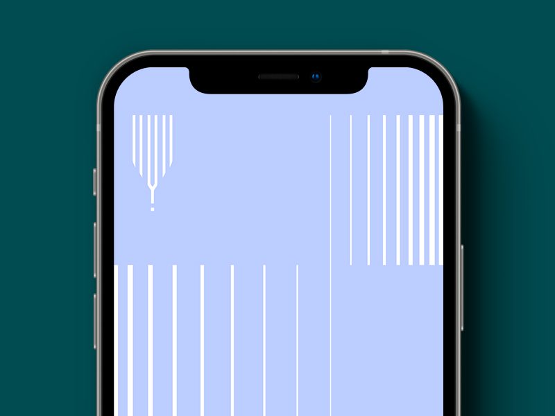
We translated this into a well known icon that embodies harmony. The tuning fork, represents Arch Capital as the instrument to fine-tune your various “notes’ within the overarching financial and family orchestra, in order to create a harmonious and sound ensemble.
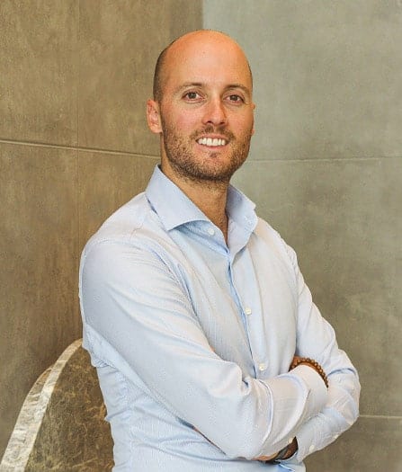
Following extensive dialogues with the owners and thorough market research, a clear path forward was defined to shape the future of Arch Capital, but also the future of wealth management in Saudi Arabia.
– Koen van Riel, Marketing & Strategy Director Skyne
How we helped Arch Capital gain focus and purpose to reach their key demographic with a cohesive and understandable message.
Research & Analysis
Business assessment
Market Analysis
Target audience research
Competitor Analysis
Brand opportunities
Strategy & Story
Brand strategy
Brand positioning
Brand story & Tagline
Central message
Concept & Design
Concept development
Brand identity design
Brand guidelines
Collateral design
Communication tools design
Implementation & Activation
Website design & build
Wire frames creation
User interface (UI) design
User experience (UX) design
