Care Medical
Heart of healthcare in Saudi Arabia

Client:
National Medical Care Co.
Challenge:
Expand into new territories with more hospitals and health service offerings. Shifting from being perceived as a solely government/semi-government hospital to a hospital that serves all kinds of diverse patients.
Result:
An extensive brand assessment including a visual audit of their current position in the market. Resulting in the development of a robust brand strategy and a new visual language, logo and story for the brand.

Leading in healthcare:
Care Medical
Care Medical is a multidisciplinary private hospital that spans across the Kingdom of Saudi Arabia. Offering state-of-the-art facilities and modern medical equipment handled with the greatest warmth and experience.
With a core focus on people, Care Medical believes that from their first interaction to their last, people need to feel engaged, heard, and understood by healthcare professionals. Thus, Care Medical believes that healthcare doesn’t just stop at treatment. It is a complete experience for patients through people-focused thinking in all aspects of their operations.


FROM INSIGHTS TO STRATEGY
A revelatory brand audit
To meet National Medical Care’s goals of changing perceptions and expansion, Skyne first had to assess their current standing in the market. What was the current brand equity? How was it measured against competitors and what perceptions does the brand hold today?
The brand audit allowed us to dive deep with thorough desk research, best practices, and competitor deep dive, investigating published papers, trend watching, and accumulated branding knowledge.
FROM INSIGHTS TO STRATEGY
Opportunities lead to a strategic story
With the assessment complete, the next stage was all about building up the care brand. We knew the current aggregated perceptions of National Medical Care in the market, the challenge now was to focus where we wanted to be and create a strong foundation for the National Medical Care brand to stand on.
Thus, building up the care brand required us to divide the brand foundation into 4 separate parts, each of which would create a perception of the brand that exactly aligned with the future vision of the company.
These were:
1. Expertise
2. Innovation and advancement
3. People-centric decisions
4. Unity and inclusiveness in healthcare
With the blocks set in motion, we built up the rest of the brand defining the story, the overall vision, promise, and mission. Thus helping us achieve values for the brand and creating a personality and tagline that brings it all together.


FROM INSIGHTS TO STRATEGY
A brand architecture that works for healthcare
One of the key criteria for National Medical Care was expansion. Challenge arose when planning future acquisitions of hospitals with lower brand equity. How will the hospitals successfully expand while retaining their brand’s equity? To solve this challenge, Skyne implemented a brand architecture model that guided the expansion seamlessly, accounting for every possibility allowing the brand to widen its horizon whilst not being diluted.
FROM INSIGHTS TO STRATEGY
“What’s in a name?” Simple and direct naming
National Medical Care Co. needed a revamped name to make it easier for people recognise and relate to them. As the original name was not as easily identifiable to its target audience, it didn’t provide enough brand equity, Skyne set out to adjust the name while remaining true to the original.
The use of the word “Care” was imperative alongside a word that allowed National Medical Care to be perceived as a hospital. The result was simple: Care Medical. With simple and to-the-point naming that gives the target audience the clearest and most transparent picture.
FRO STRATEGY TO DESIGN
Putting people’s hearts, at the center
Uniting various different elements into one. This concept is derived from a holistic approach to care. Based on the 4 core base principles established in the strategy.
The symbol is inspired by the medical symbol of life. We developed it further to convey the convergence of expert medical professionals and technology to form a heart at the center. This symbolises care for our patients, which is the beating heart of Care Medical.
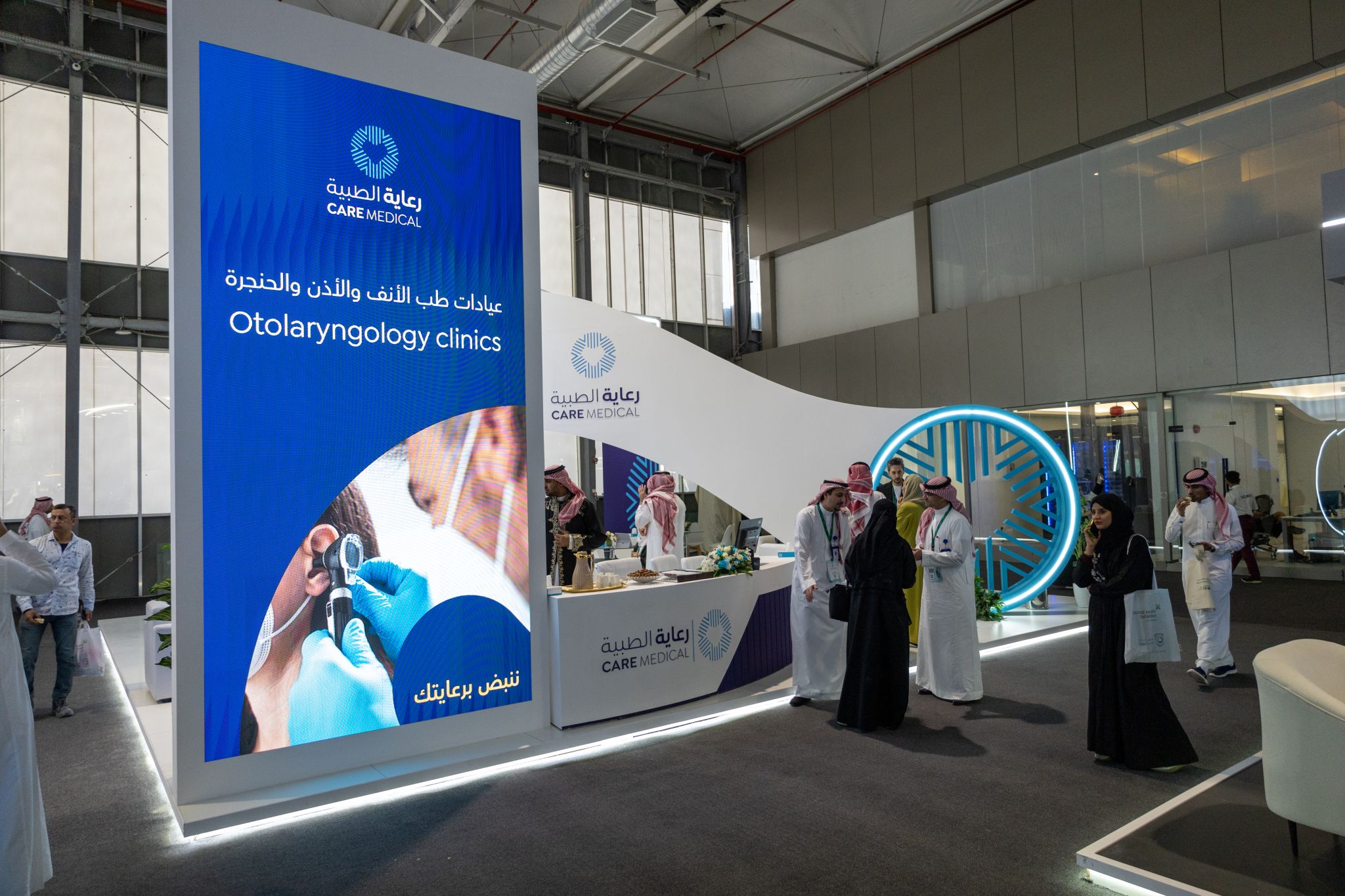
The logo, which consists of both an icon and logotype in Arabic and English, follows the similar thread. The unique icon showcases the coming together of medical experts and care professionals, to meet at the center. This is where you will find the heart of Care.
Watch the brand unfold its identity for the future at an exclusive launch event.
How we helped Care Medical realign itself to the Saudi healthcare vision
Research & Analysis
Brand Assessment
Target audience research
Stakeholder research
Customer journey mapping
Brand opportunities
Strategy & Story
Brand strategy
Brand naming
Brand positioning
Brand story
Central message
Guiding principle
Concept & Design
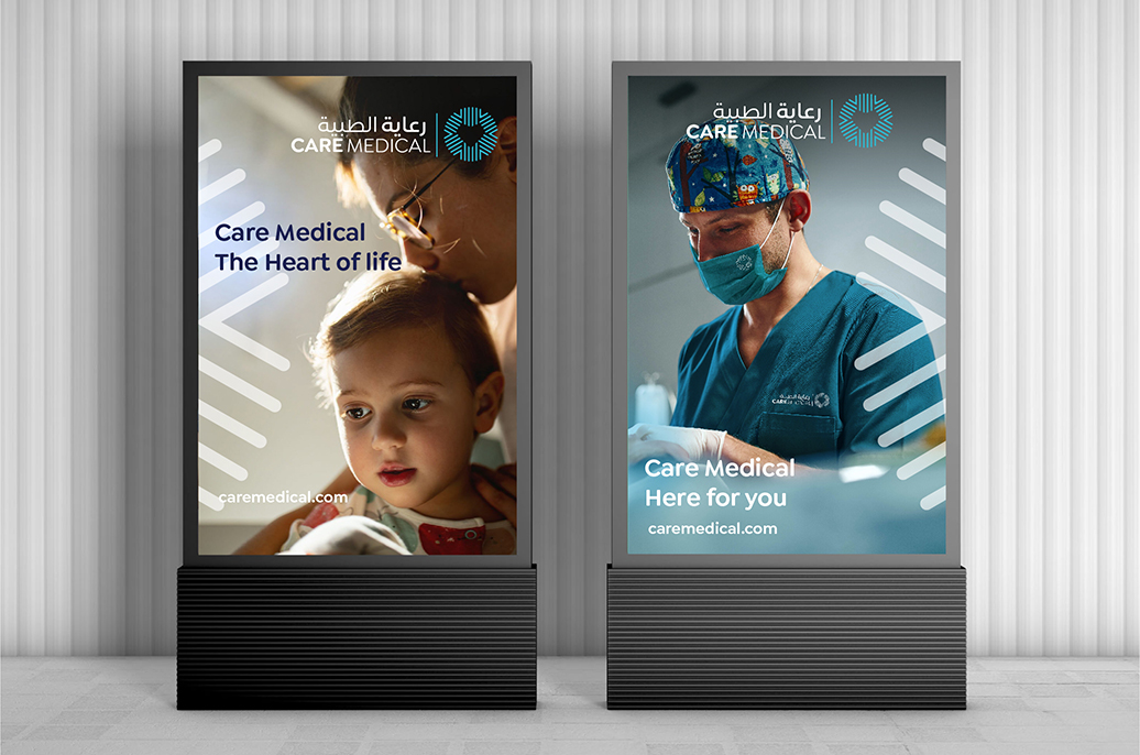
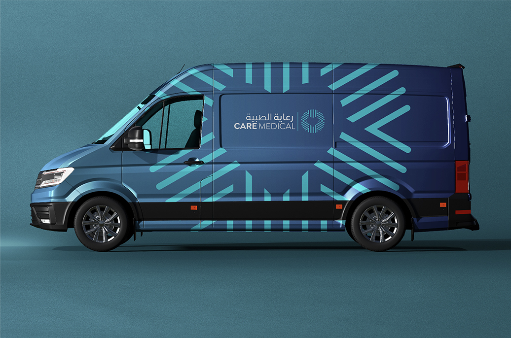
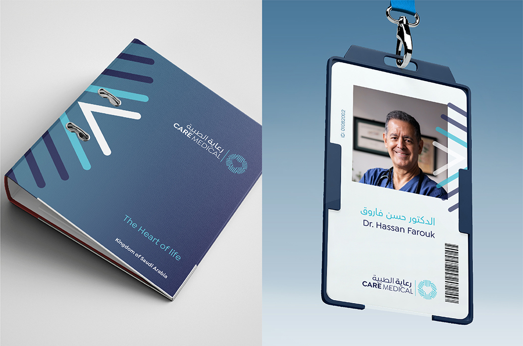
Brand identity design
Brand collateral design
Communication tools design
Brand guidelines

It was my pleasure to collaborate with Skyne team to lead, create such great brand during my time at NMC Company.
A very exciting project and valuable contribution, Skyne will be always my top of mind choice for building distinguished brands.
– Hassan Al-Hashem, Senior Director Marketing Communications
“With the brand assessment for Care, we were able to thoroughly examine the landscape as well as look for those Golden nuggets that informed our strategy and direction.”
– Lubna Farooqui, Creative Brand Strategist

