Care Medical
Realigning a healthcare leader for national expansion
Care Medical is part of National Medical Care Co., one of Saudi Arabia’s leading private healthcare groups, with multiple hospitals and clinics operating across the Kingdom. As they prepared to scale, they needed a brand that could grow with them.

The Shift
National Medical Care Co. needed to break away from the perception of being a government hospital. With expansion on the horizon, they had to reposition as a modern, inclusive, private healthcare provider serving a broader, more diverse patient base.
The Breakthrough
Skyne conducted a full brand audit and competitive analysis to map out current perceptions. We built a new strategy, simplified the name to “Care Medical,” and delivered a people-centered identity aligned with Saudi Arabia’s healthcare vision. The result: a scalable brand ready for nationwide growth and future hospital acquisitions.
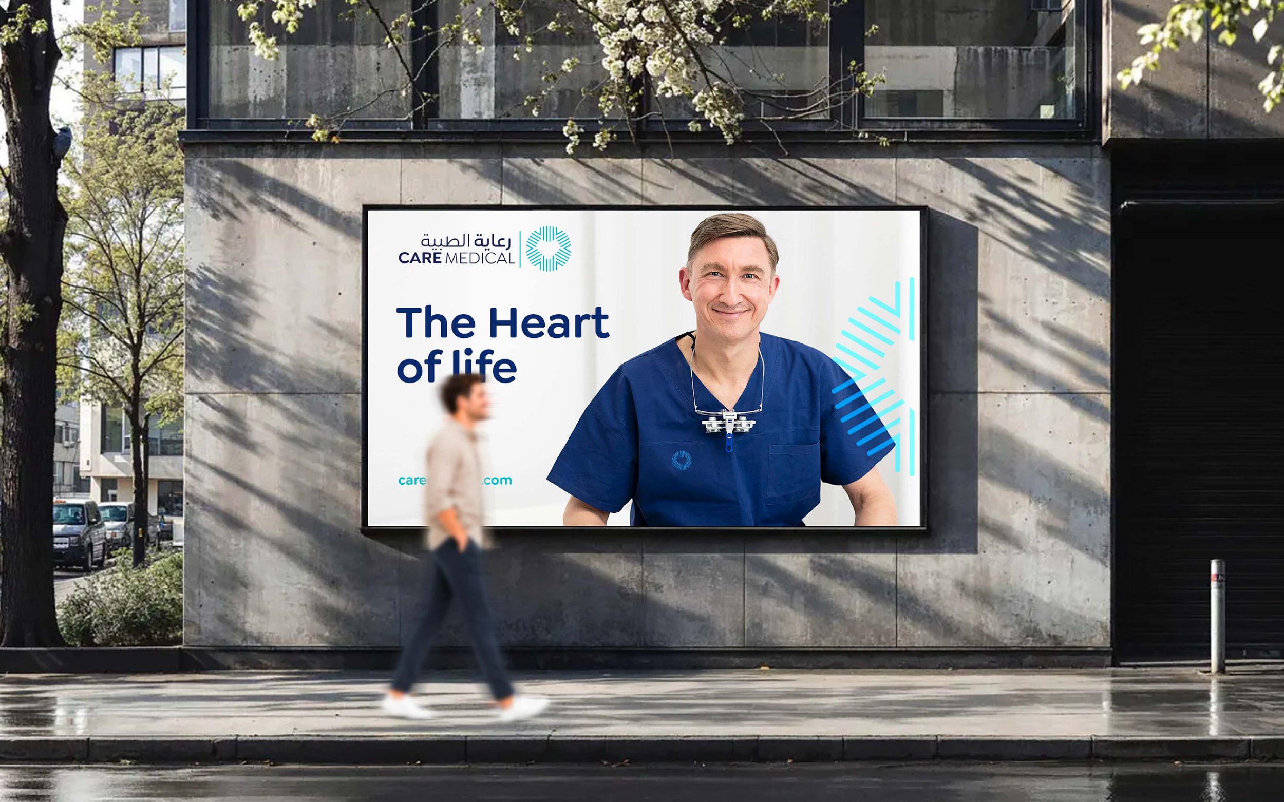
Healthcare Branding and Repositioning for Growth
We shifted the narrative from institutional care to inclusive, people-first healthcare. The new brand strategy was structured around four pillars: medical expertise, innovation, people-centricity, and inclusive care. This foundation guided all brand elements moving forward.
The good physician treats the disease; the great physician treats the patient who has the disease.
A Scalable Brand Architecture
To support future acquisitions and market entries, we developed a clear brand architecture. It enabled Care Medical to absorb lower-equity hospitals without diluting brand value, allowing seamless growth across the Kingdom.

To support future acquisitions and market entries, we developed a clear brand architecture. It enabled Care Medical to absorb lower-equity hospitals without diluting brand value, allowing seamless growth across the Kingdom.
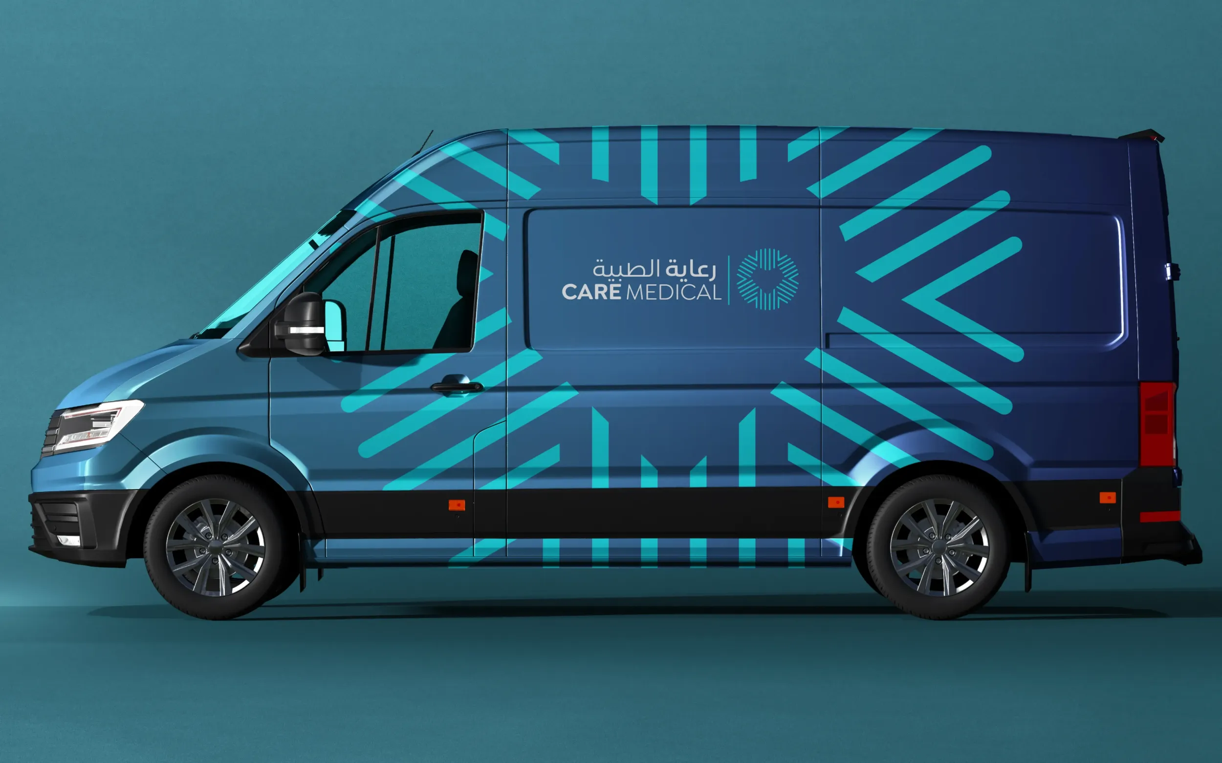
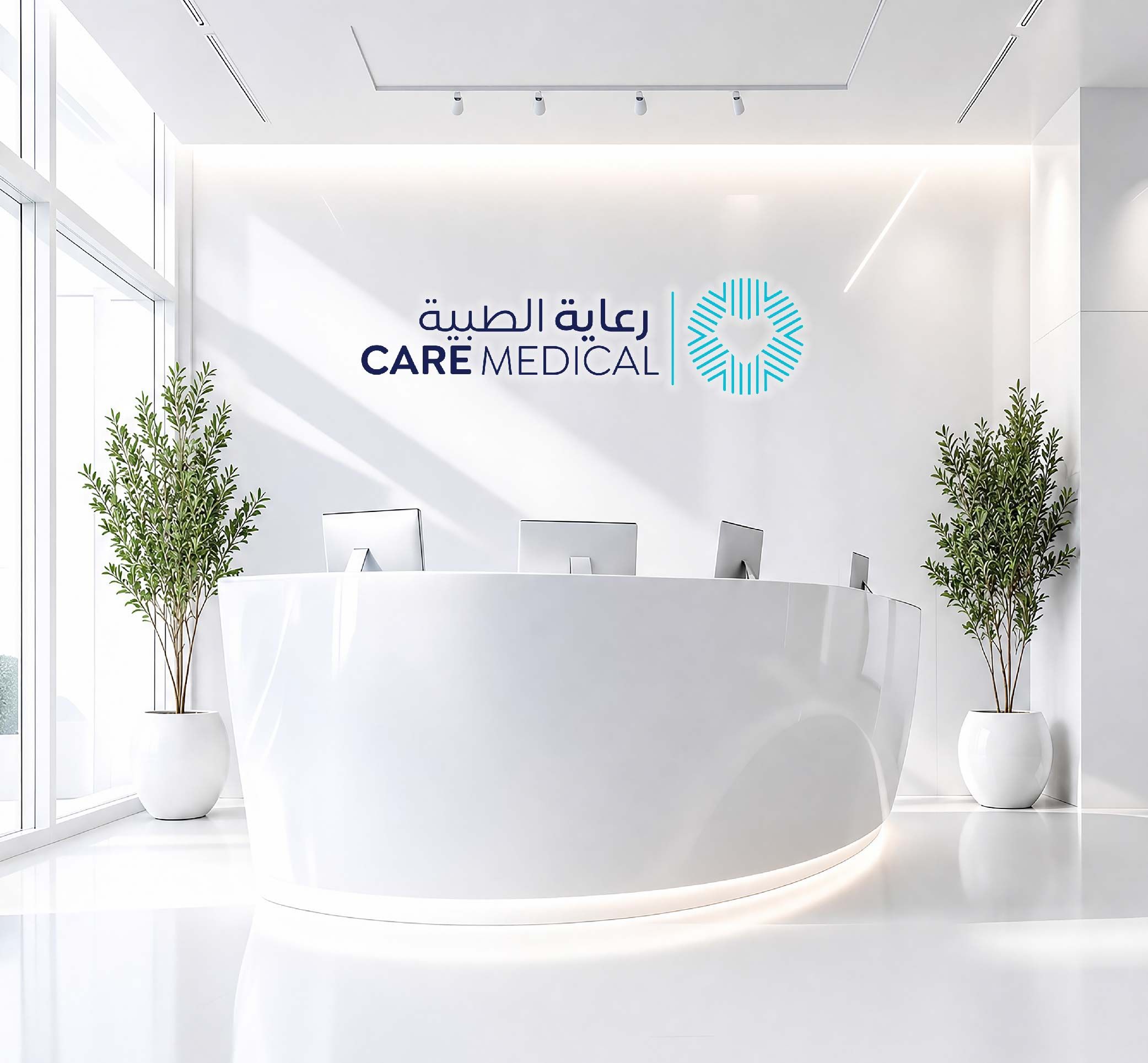
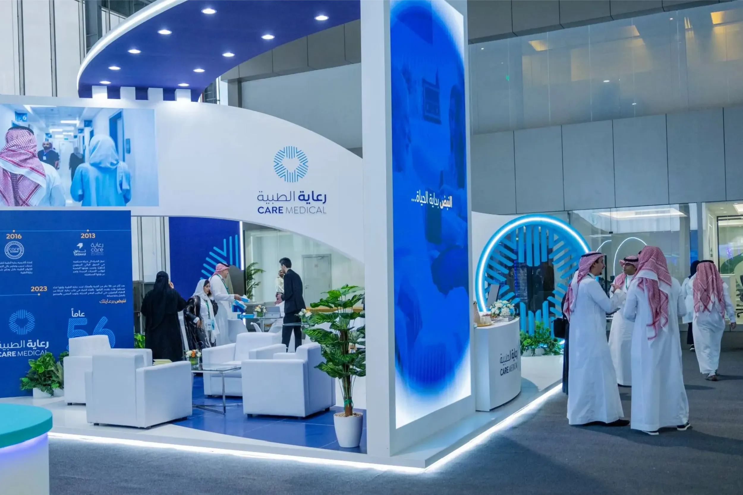
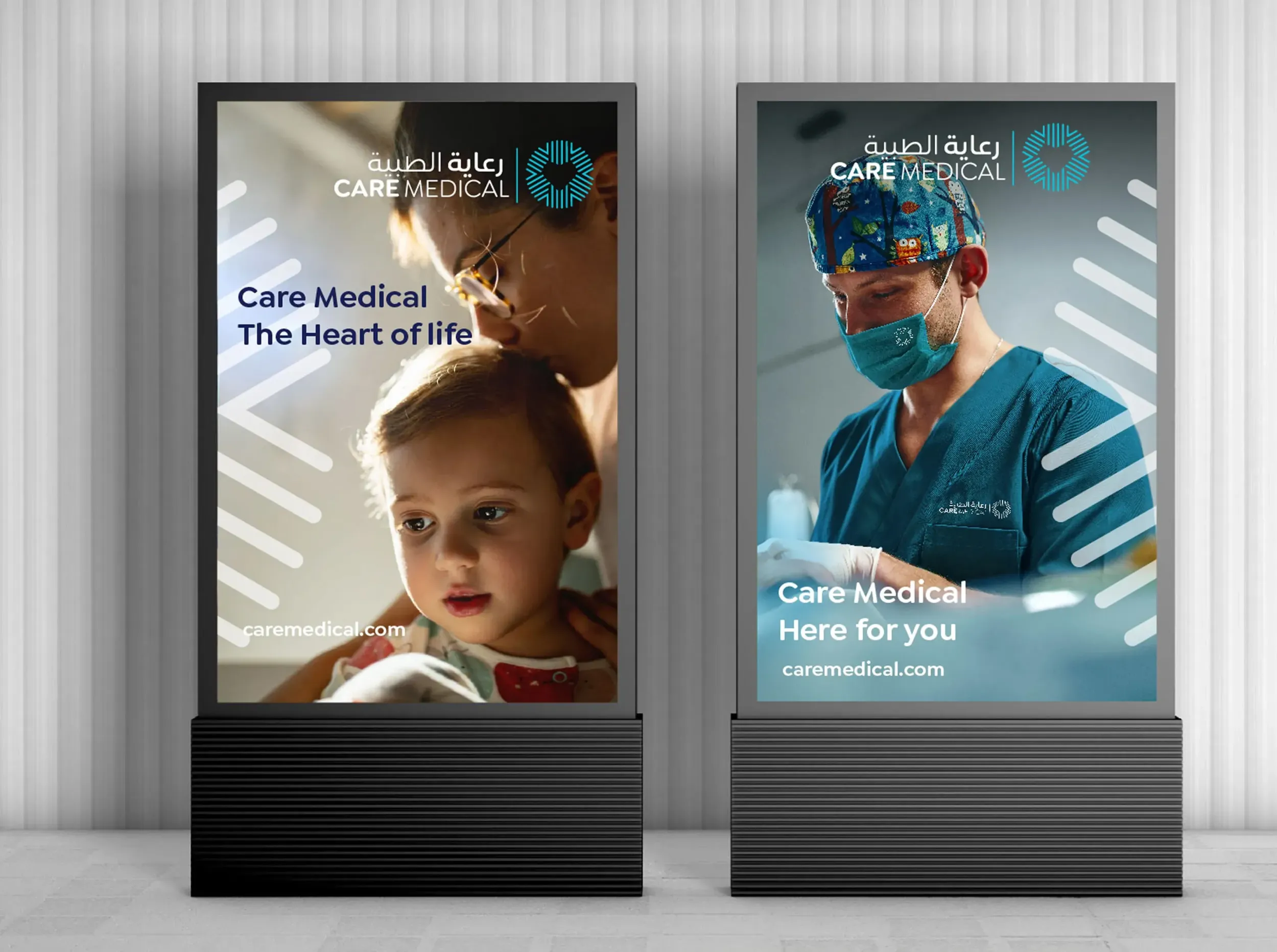
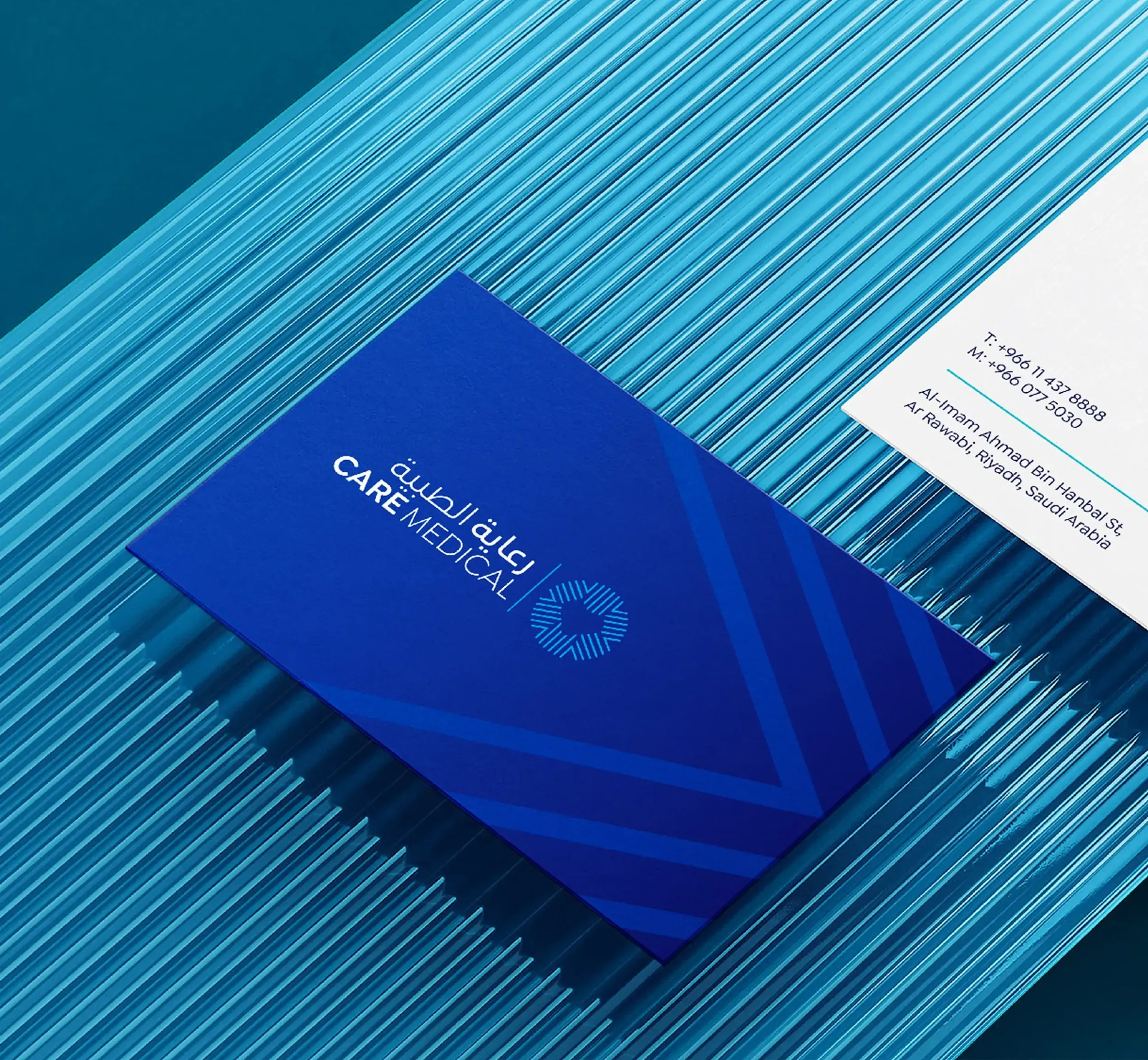
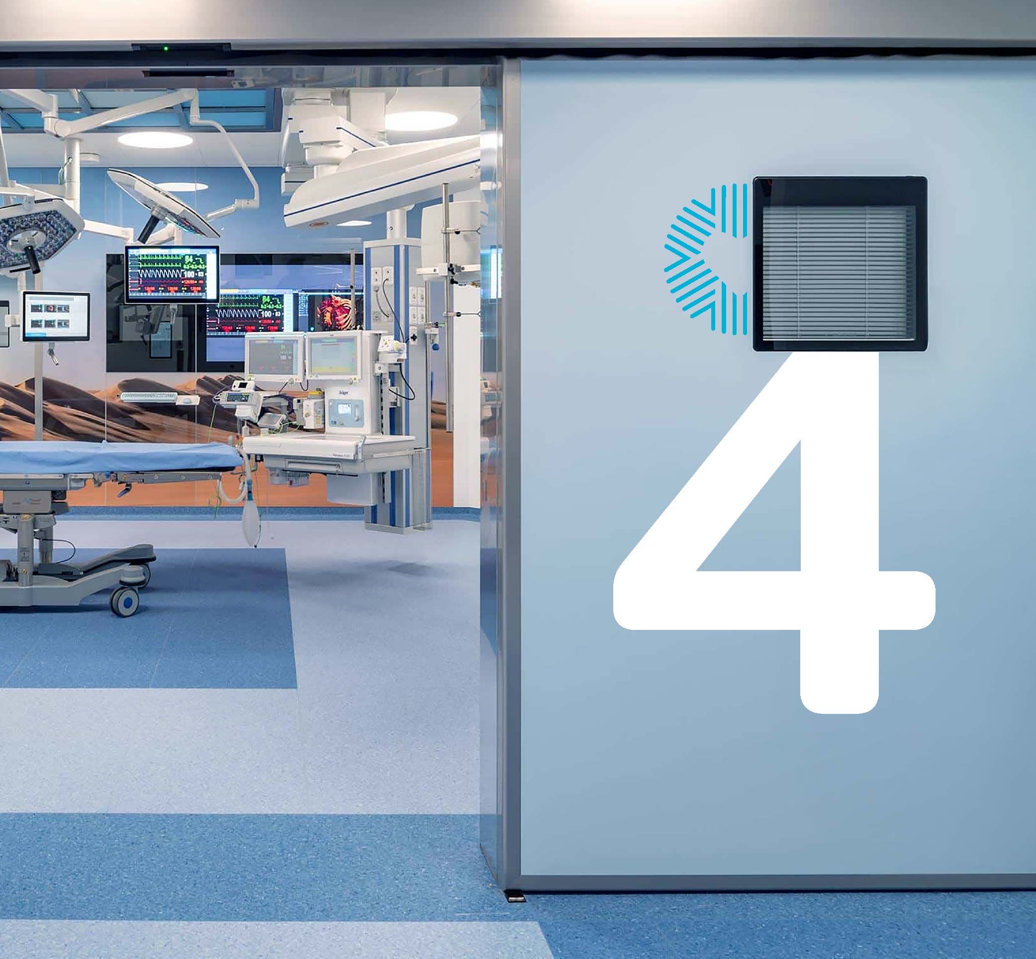
Visuals that Reflect Care at the Core
We designed a unifying identity that brings together innovation and empathy. The icon symbolizes medical precision and human warmth, converging in a heart shape the emotional and functional center of the brand. Arabic and English lockups ensure cultural resonance and regional relevance.

Hassan Al-Hashem
Senior Director Marketing Communications
It was my pleasure to collaborate with Skyne team to lead, create such great brand during my time at NMC Company. A very exciting project and valuable contribution, Skyne will be always my top of mind choice for building distinguished brands..
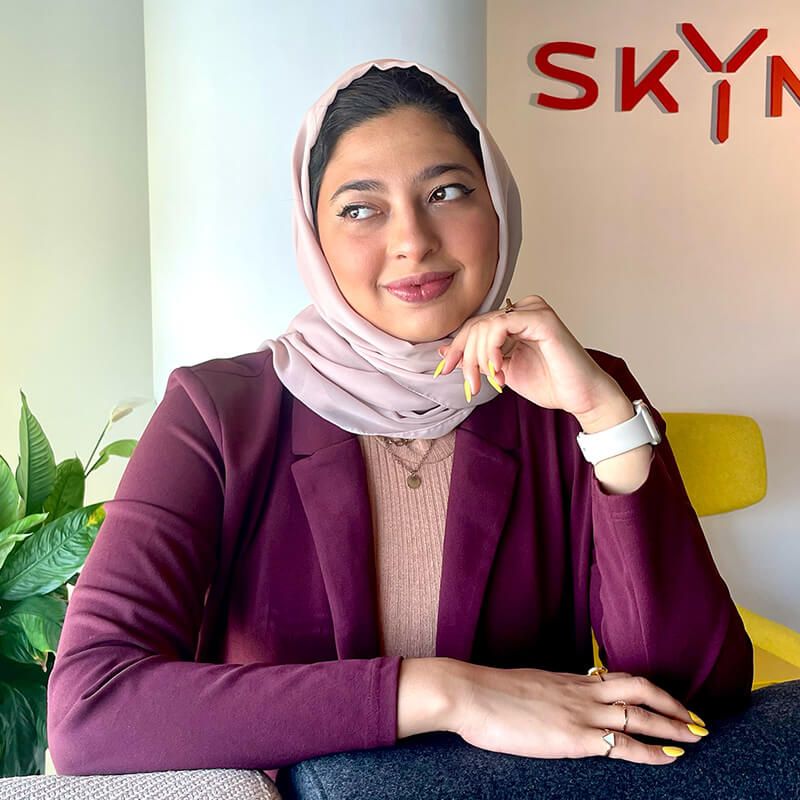
Lubna Farooqui
Creative Brand Strategist
With the brand assessment for Care, we were able to thoroughly examine the landscape as well as look for those Golden nuggets that informed our strategy and direction.