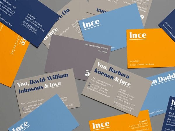
After the merger of Ince & Co and Gordon Dadds in December 2018 Skyne was instructed to assist the firm with its rebranding project, taking into account the legacy and DNA of both firms. The project included our advice on the firm’s new name, its brand positioning, brand strategy and brand identity. The challenge was to showcase the real character of the organization and to make it stand out from the crowd, all within 6 weeks from start to finish.
- Research and analysis: Brand assessment, Market analysis, Target audience research
- Strategy and story: Mission & Vision, Brand values, Brand personality, Tone of voice, Value proposition, Brand positioning
- Concept & design: Brand identity design, Brand architecture development, Brand collateral design, Communication tools and sales tools design
- Implementation: Project management, Collateral and sales tools design and development
Ince, or Ince Gordon Dadds as it was formerly known after its merger of the two respective firms, is an international legal and business services firm with a heritage reaching back about 150 years. They are renowned for providing the highest quality legal advice and strategic guidance to their clients across Asia, Europe and the Middle East.
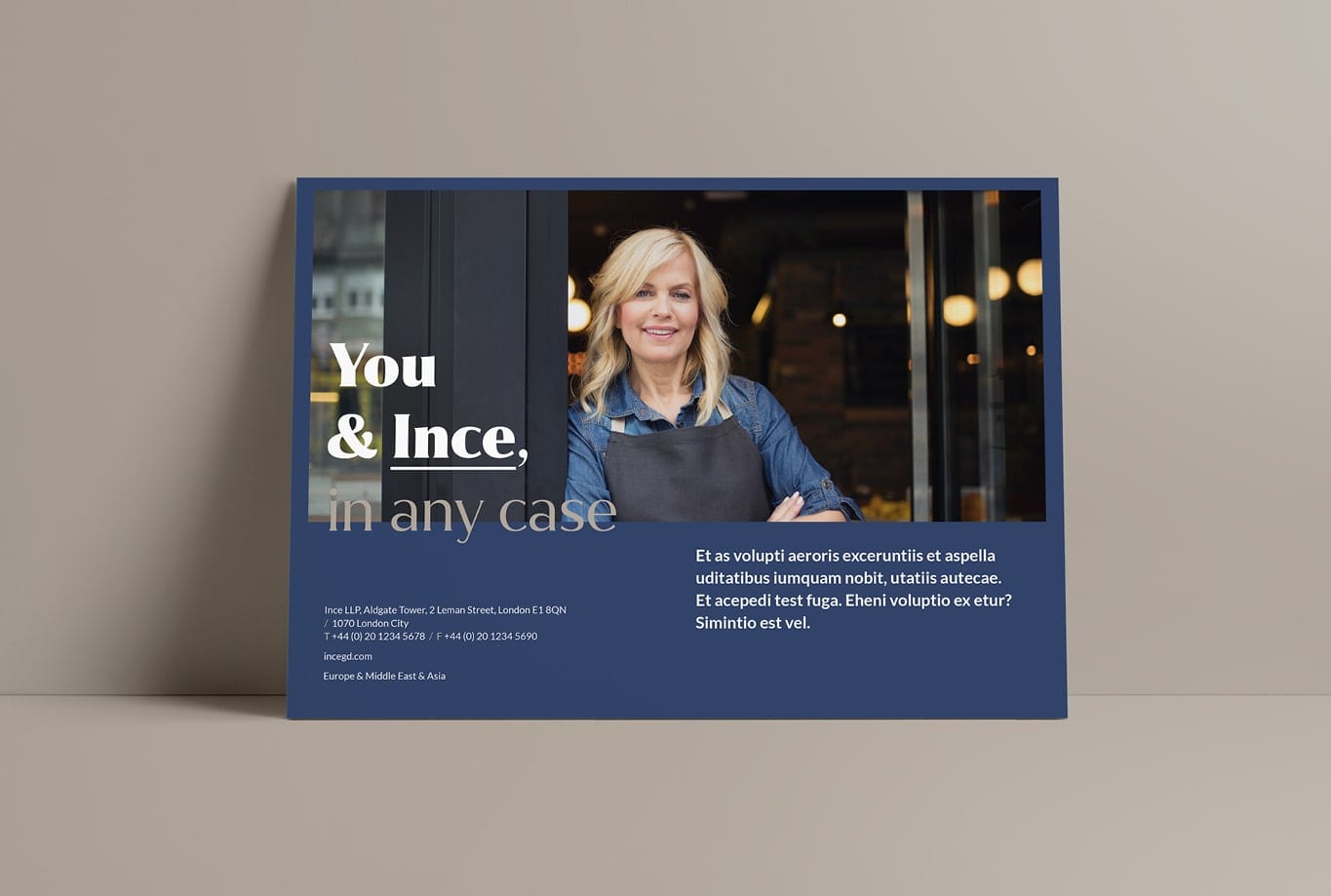
Although the pre-merged entities had different names and brand identities, some of the characteristics of each brand appeared to be similar. Those similarities within the company culture and values were the building blocks for the new brand strategy. Through research, workshops and co-creation we were able to develop a new brand promise; Ince – in any case. Ince promises clear decisions through strategic guidance and well-considered advice. It is the belief of Ince that people, excellent service and guidance on a global scale play a most important role. Ince promises to be your business partner and your guide with clarity, focus and diligence.

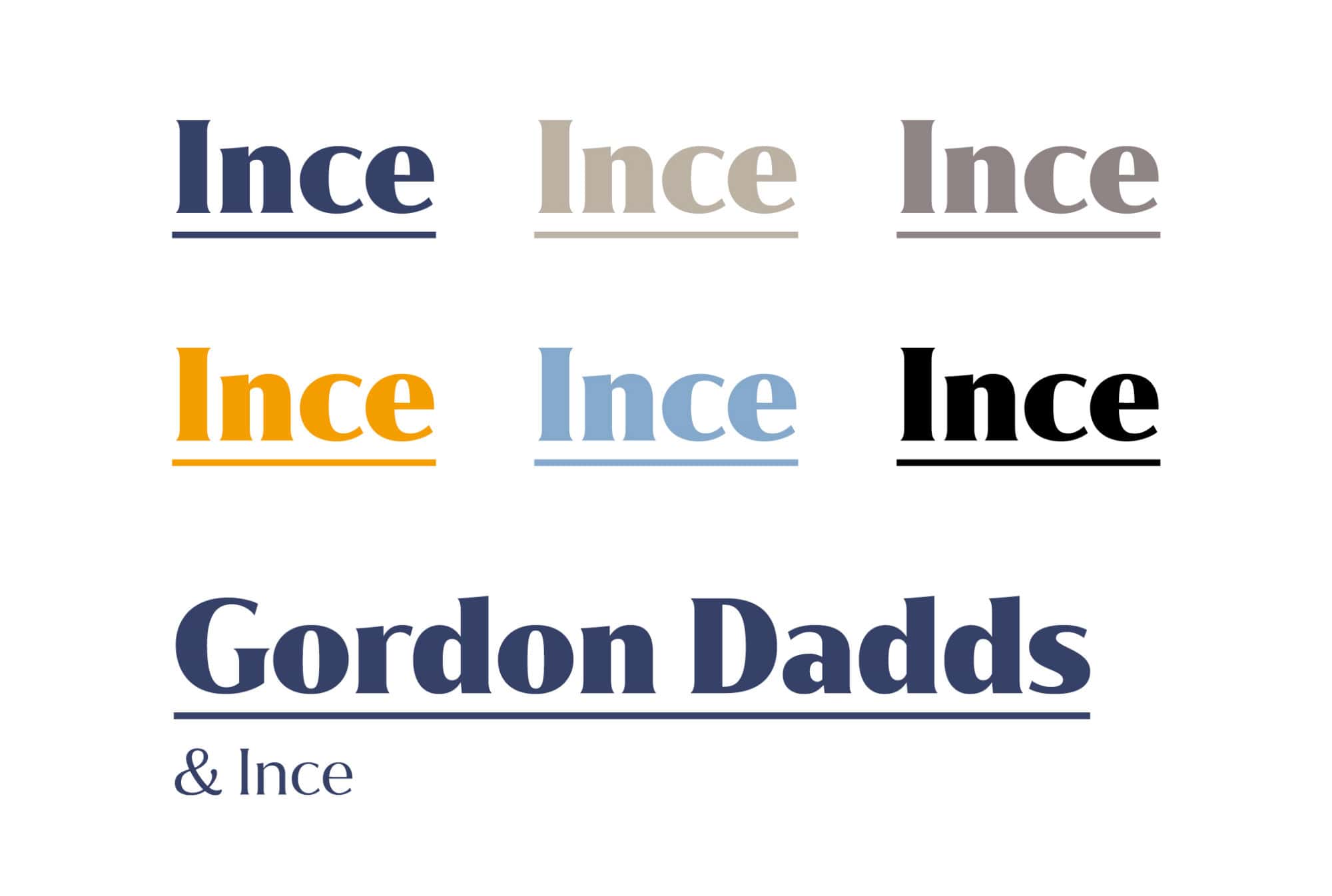
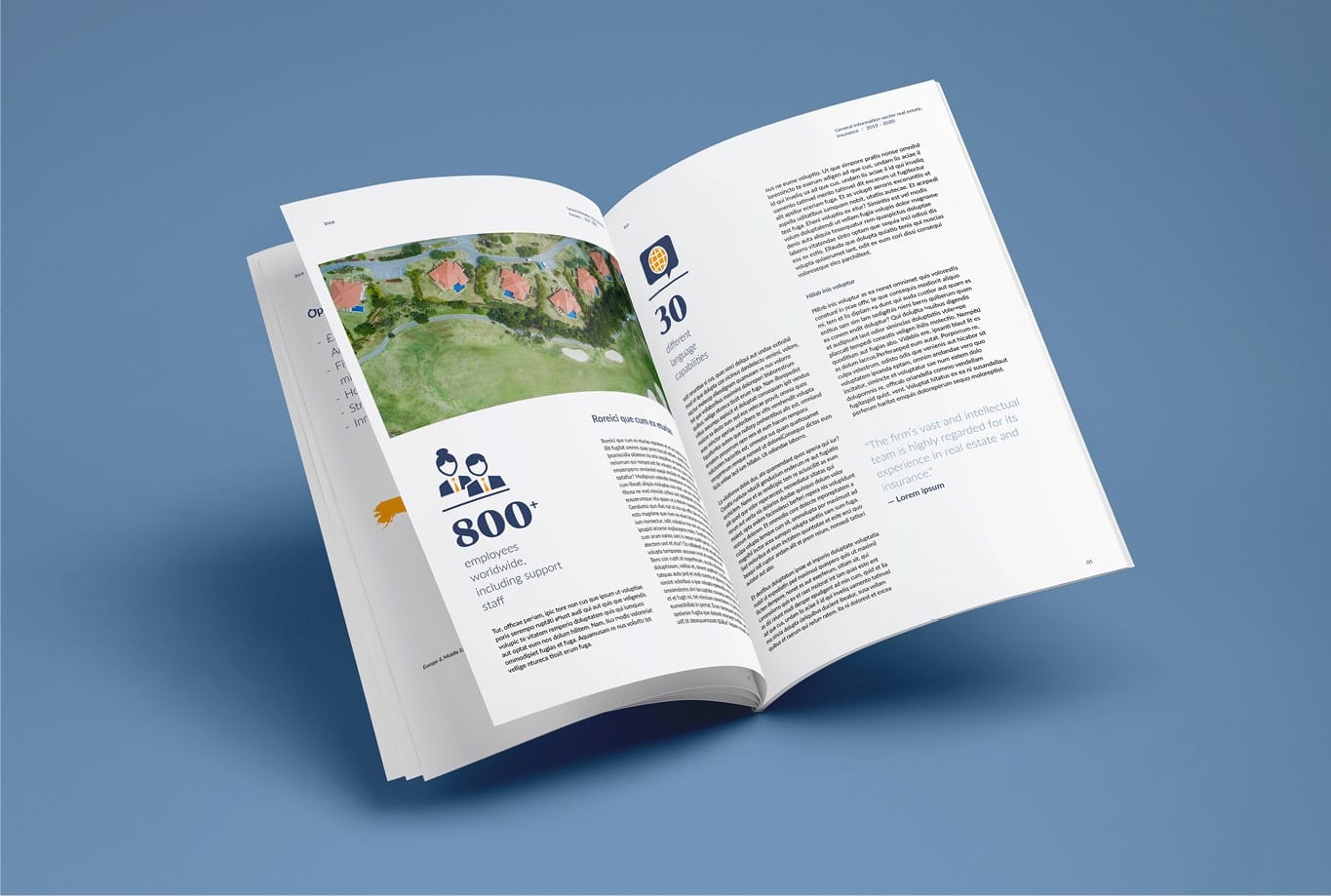
Charismatic and outspoken. In line with the company’s character and brand strategy, Skyne developed a matching and refreshing brand identity that clearly makes the company stand out in the market. Ince values personal connections and partnerships. By portraying Ince as an intelligent, charismatic and outspoken character with a convincing but warm tone of voice, we symbolically visualise that human aspect within the firm. This is visually achieved with a typographic solution that is bold, clear and full of character. The brand identity, including collaterals design and brand guidelines, was further implemented into various communication tools.
Ince has implemented the new brand strategy and brand identity in all aspects of the organisation. This project has been executed in close cooperation with the client. Multiple co-creation sessions and workshops served as the foundation for a strategic shift. Ince steered towards a more centralised organisation with a clear singular mission, vision and identity that is strong and allows the firm to focus.
“Working together with Skyne on this important project was very refreshing. They are full of creativity but also really make every effort to understand the industry in which we operate. Their research skills are second-to-none which formed the perfect foundation to build a brand of which we are all very proud – in a relatively short period of time.”
– Ince

