I really enjoy researching at the start of a new identity project. It’s one of the joys of being a designer – to explore, read, visit, experience and to become an expert in your new subject. It could be in automotive, food, sport, fashion or a destination. Whatever the topic, we need to get fully into it. If we are to bring our strategic and creative expertise to transform brands, we first need to understand it and know it, inside out.
“If we understand the real heart and soul of a place, we can begin to capture its passion, personality and heritage – its ‘pride of place’. We can learn about a city’s past, but knowing how it lives and breathes will determine how we can shape its future.”
I love to travel, so I would like to take you on a small journey through the cities of Seville, Glasgow, Paris, Edinburgh and Porto.
I am native to one of these cities and I like to think I understand that city well, through all its nuances, cultural behaviour’s and social attitudes. Native to the city or not, it is absolutely essential to make sure we know all the history and facts, not just a light skim of sound bites or second hand experiences. After all, our work must be credible, authentic and original.

Sevilla, Andalucía, Spain
This beautiful city is a true Spanish phenomenon, bursting with colour and passion all year long. Magnificent history is all around, but it’s also a modern and ambitious city, where Sevillianos make their mark.
The climate in Sevilla is similar to that of my home in Dubai – pleasant winters and very hot summers. This plays a part in the city’s character; daytime siestas, late night socialising, music and of course, Flamenco. Sevillianos embrace life, with the emphasis on enjoyment!
When Sevilla FC, one of the city’s premier football clubs, decided to rebrand, they ignored the temptation to go for an ultra modern, stylistic image. Instead, they looked into the essence of the city, past and present. The result is an outstanding impression of the club and the culture of the city. All played out in a fresh, contemporary design. The colour palette, imagery, typography and design grid all come from the rich provenance of the city. Agency, Summa.


Glasgow, Scotland
Next up is Glasgow, quite the opposite of Sevilla in terms of weather, but no less passionate for culture and the arts.
It was no surprise that Banksy chose Glasgow to host his solo show ‘Cut and Run’. His first major show in 14 years.
He loved how the people of Glasgow poke fun at authority with wit and humour. An example of this is the rather pompous Duke of Wellington statue, which has an orange and white striped traffic cone placed on it’s head every day by people unknown. As soon as the council workmen take it down, someone puts it back up again.
Another creative powerhouse was Mr. Charles Rennie Mackintosh, artist, designer and world-class architect.
His art nouveau ‘style’ was ground-breaking and ahead of its time. His unique handwriting style and creative work became synonymous with the city and is still widely associated with Mackintosh throughout the world.
In 1999, Glasgow was named European City of Culture. As part of this celebration, a new identity was created, together with a new take on the Mackintosh style. This was created by Erik Spiekermann’s Meta Design. It is inspired by the Mackintosh style and the American grid structure of the city streets.
Long after the European City of Culture event, the typeface has been widely adopted and is still used by the Glasgow School of Art (GSA) as their official font. The GSA was designed and built by CR Mackintosh in 1899, so it is nice to see creativity still to the fore in the city. Agency, Meta Design.


Paris, France
Paris was the first city I ever visited in mainland Europe, and what an experience it was. The ‘city of love’ is steeped in history, art, design, culture, fashion and food. This is reflected in the many identities around the city, from the Metro, to the Moulin Rouge.
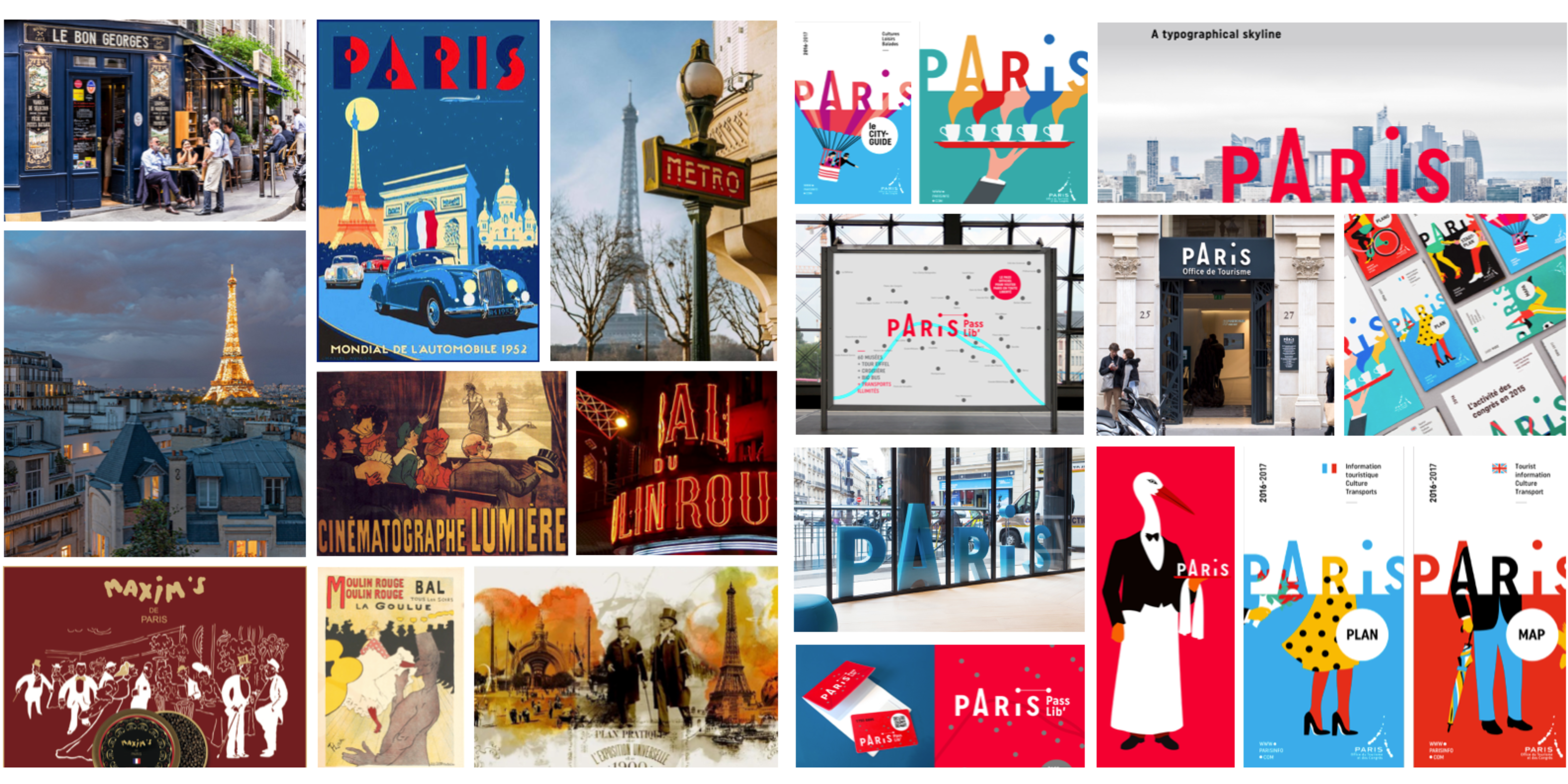
A wonderful example of this is the identity for the Paris Convention and Visitors Bureau. It would be difficult not to reference the iconic Eiffel Tower, but the identity carries much more than just one component. If you must use the Eiffel Tower, try to do it in a way which becomes an intrinsic part of the design system. This was exactly what the designers achieved.
Making reference to the art of Paris, such as La Belle Epoque era, Maxim de Paris and Folies Bergère, the new identity characterises the playfulness and drama of the city, but in a modern and fresh way. It also has a functional purpose, so a solid design grid is in place to communicate the message.
The identity was first launched in 2015, but is still in use today, following various refinements. For me, this identity captures the vibrancy, energy and passion of the city in a friendly way. Agency, Grapheine.
Edinburgh, Scotland
Edinburgh is the capital city of Scotland. A city with a long and rich history. Its centre is defined in two parts, the ‘old town’ and the ‘new town’. The ‘old town’ is home to Edinburgh Castle, Holyrood house, The Royal Mile and a fascinating network of narrow lanes and closes. Many of which inspired the magical ‘Harry Potter’ Stories. The ‘new town’ was created out of the need to provide a modern, clean and inspiring side to the city which sent out a statement to the world that Edinburgh was a leading player on the world stage. The ‘new town’ was built on a grand scale, with wide streets and parks. The architecture is impressive and matches those of any other leading European city.
Edinburgh was the city of enlightenment (the Athens of the North), with great advances in medicine, philosophy, economics, finance, the arts and literature. Today, there are still visible signs of this enlightenment everywhere.
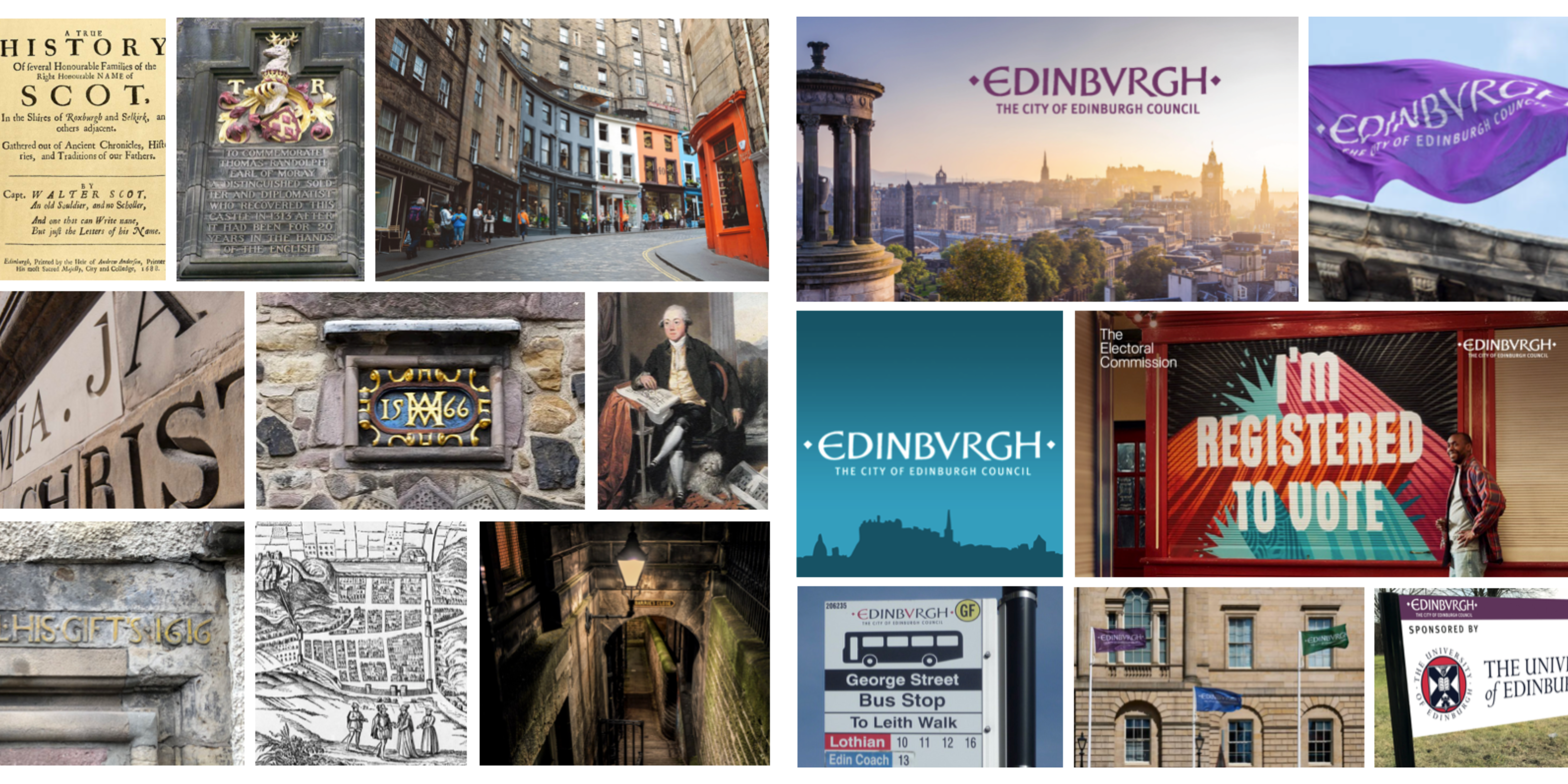
One particular facet of this is the architecture and crafted lettering which is still in use today. When Edinburgh City Council decided to create a new identity they turned to their ‘living’ history which is all around the city.
They use a wordmark which captures the essence of Edinburgh, in its personality and its rich history. The city cannot escape its old world charm and its characters from the past, so why try to ignore it? Millions of tourists come to Edinburgh every year, just to experience this ‘other worldly’ place, and they love it!
The identity is still in use today as it perfectly represents the many historical aspects of the city. Agency, In house.
Porto, Portugal
Located along the Douro River estuary in northern Portugal, Porto is one of the oldest European centers and its core was proclaimed a World Heritage Site by UNESCO in 1996.
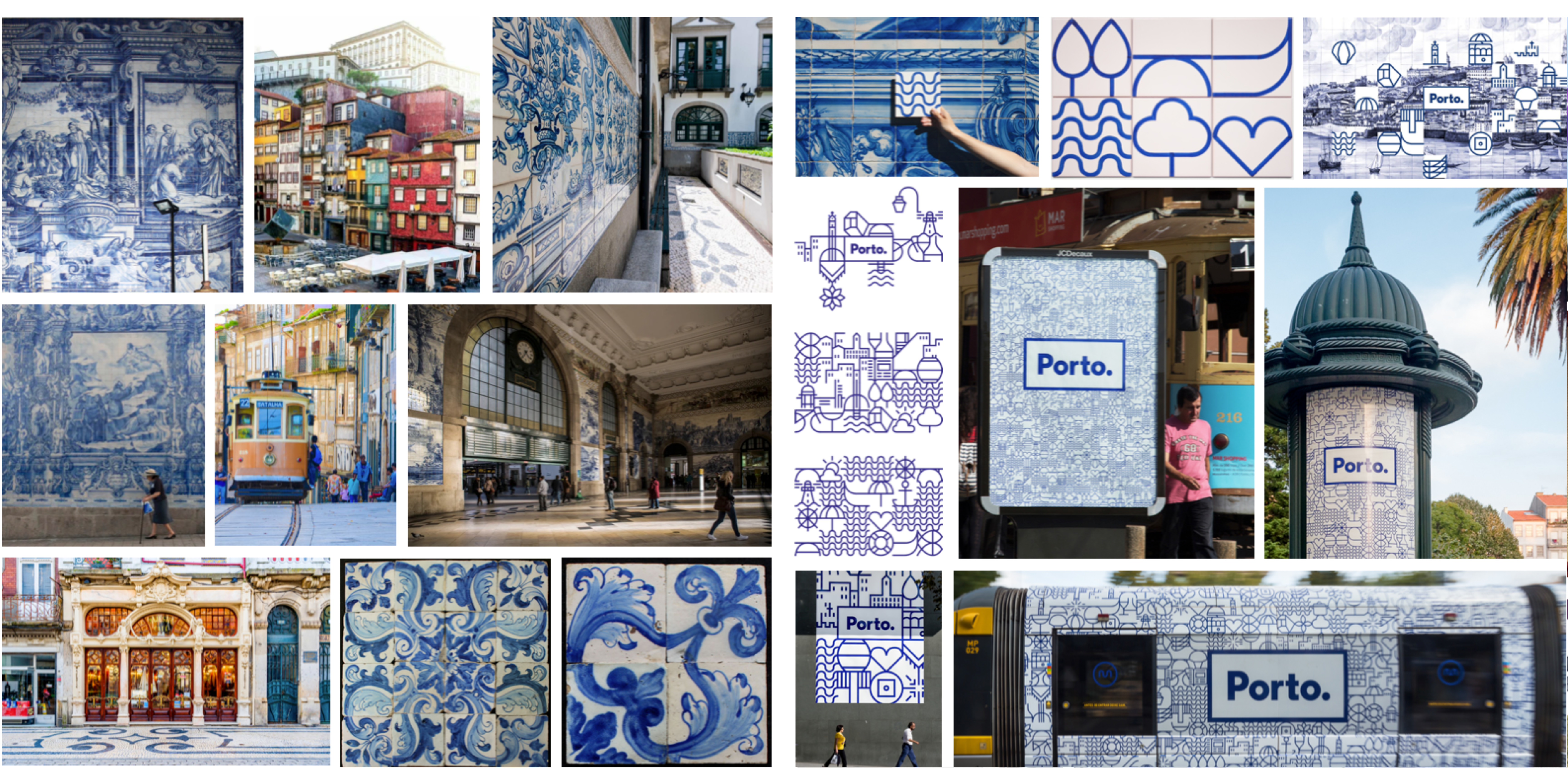
As you wander around Porto, you will quickly begin to see the Azulejos. These are wonderful blue ceramic tiles, either in decorated patterns or large scale visual story telling.
Of course they are decorative, but they also help to naturally cool the temperature of buildings. New cooling technology can bypass the need for Azulejos, but many new buildings will have them as features, such is the popularity of these tiles throughout the city.
Porto required a visual identity that would streamline communication and establish a clear hierarchy. To present Porto as an inclusive city.
When the city identity was being developed, a dynamic and adaptable system was adopted which was heavily inspired by the city’s classic blue tilework.
Over 70 geometric icons were created based on a grid system, allowing for endless combinations to form a visual network that mirrors the city’s intricate nature. This flexible identity means each icon can stand alone or be integrated into complex patterns. Designed to evolve with the city, this system ensures that Porto’s visual identity grows and changes over time.
It is always surprising and continues to tell the stories of this great city. Agency, Eduardo Aires.
A Sense of Place
So in this short journey, it is clear that there is a real depth to how people feel about their ‘sense of place’.
At Skyne, when we develop destination or place branding, we take a deep strategic approach. We visit the location and talk to the local people as well as consulting with various local entities, we can then begin to build a genuine picture of ‘the place’. Once we have a clear direction, our teams draw on this knowledge to create an inspiring and meaningful identity which aligns with its essence.
Skyne has completed many destination and place branding, including, Hinu Oman, Al Rafisah Dam Sharjah, Greenpeak Jebel Akhdar, Sohar Port Oman and Mleiha Sharjah. With current exciting projects in Saudi Arabia, Oman and beyond.

